Cambridge University and the city of Dublin both launched brand campaigns this month.
Each of them looks different from ‘the usual’, but if you put them side by side (and put yourself in visitors’ shoes), Cambridge’s campaign is the only one that actually has something to say.
Dublin: just a pretty face
There’s something a little surprising about hand-drawing a logo for a capital city. It’s a shame, then, that “a breath of fresh air” is such a predictable tagline.
We also spotted this ad on the tube:
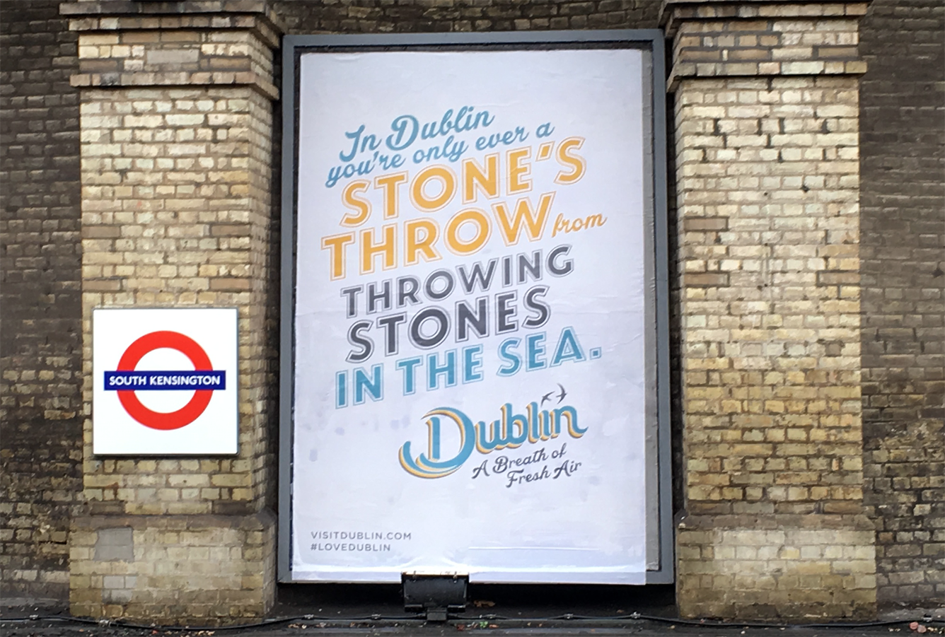
Again, it’s sort of refreshing not to see tourist-y photos, but the words hardly add anything.
Fáilte Ireland’s press blurb explained that the identity is designed to promote Dublin as a place “where city living thrives side by side with the natural outdoors”. Or to put it another way: it’s a city near green bits and the sea. And even then, they’ve said that really literally.
Depressingly, like a lot of branding these days, it looks nice, but that’s about it. And that’s pretty much what people think about it too.
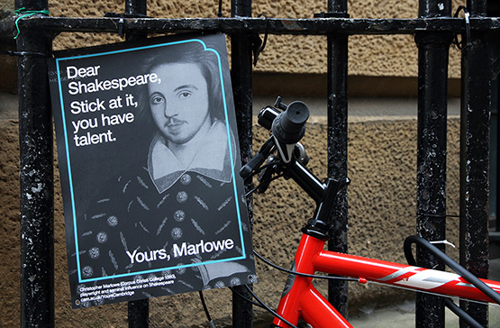
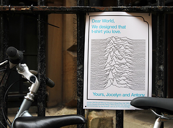
Cambridge: brains and looks
We can’t even imagine how difficult it must have been to work with the fellows and academics at a University made up of 31 colleges. So it’s all the more impressive that johnson banks have come up with such a strong campaign, and one that’s so different to other university marketing out there.
What makes it work (and probably what stopped the campaign from getting messed up in ‘stakeholder workshops’) is that there’s one strong idea behind everything, which can be used in lots of different ways. At its simplest, the conceit is that Cambridge is writing a letter to the world about the profound impact it has made, from discovering gravity to the pulsars on Joy Division’s album covers.

There’s also a video that goes with it fronted by David Starkey (really?) that, aside from a few token examples, doesn’t do much to change any preconceptions you might have of Cambridge as an elite University. Which is a missed opportunity, especially as they often face criticism for not doing enough to widen their intake to people who aren’t white and from posh schools.
That niggle aside, it’s just good to see a campaign with a proper idea behind it. And for once to see the art direction take second fiddle to the words.