All posts by admin

FIELDEN: GRAIN CHANGING

Most old-school whiskies come with a backstory about an eccentric founder and a spring with near-mystical qualities. But the grains that go into the whisky? You never hear much about those. That’s because this part of the story isn’t quite as whimsical. Most grains in whisky are grown industrially, with chemicals: same grain, same height, same flavour.

Enter Fielden, who are bringing England’s fields back to life with heritage grains grown on regenerative farms. Their grains grow in white clover (without any chemicals) in fields full of plants, wildflowers and insects.

When you write about a brand that’s genuinely changing the way grains are grown and fields are farmed, the hardest thing to grapple with is “greenwash” and simpler (but often murkier) eco claims. “Carbon neutral” (or “negative”) is a classic case in point: it can just mean business as usual while paying to plant trees elsewhere. “Carbon neutral airports”, we’re looking at you…

We know from our work with Honest Burgers that regenerative farming isn’t easy to sum up in a soundbite. For Fielden, we had to get an environmental message across to a whisky-buying audience without overloading them with farming terminology or over-simplifying what’s involved.

MAKE A STATEMENT: we created WILD AND GLORIOUS as Fielden’s word mark, along with a series of statements about how they’re changing farming and whisky. These work as single lines or in pairs to match Made Thought’s visual idenity, linking what you can see above ground (tall stems and wild fields) with what’s going on below (deep roots and healthy soil).
UNSHOWY: to stand out from greenwash, we wrote about how Fielden’s doing things differently in a strident but spare tone (and without empty “planet friendly” catch-alls).
IN THE FIELDS: we also helped shape Fielden’s brand strategy and wrote their brand guidelines. While their distillery, stills and casks all play their parts, Fielden put the fields first, mud and all.
And instead of writing about distilling and ageing, Fielden write about the depth of flavours from the heritage grains. In these tasting notes we’re deliberately writing about wild berries and hedgerows to evoke the countryside, while baked bread nods to the harvest.

Visual identity by Made Thought and more design by NotonSunday.

ONES THAT GOT AWAY: VIAPLAY ADS

Sarah Lund and Saga Norén were moving to the UK (kind of) and Viaplay, the Nordic streaming company, asked us for some ideas to launch their service over here. Nordic Noir was always going to be the way in and the brief included some photos of where Viaplay’s ads were going to appear. The beautiful view over the A3220 through West London looked exactly like locations in The Killing or The Bridge to us… job done!

Their media planning locations looked like a Nordic Noir set.
A Nordic Noir home from home: where Viaplay’s UK launch ads were going to be.
Do you ever feel like you're driving through a Nordic Noir set?
It's never just a bridge - is it?
Nordic Noir on a plate! These ads pretty much wrote themselves.
All this needs is a Swedish tortured detective.
Nordic TV directors would kill for this lighting.
Train carriage ad
We played with locations in different ways, too. A train platform or a carriage – all perfect settings for your next favourite Nordic Noir TV series. Watch your back.
In Scandinavia this is a crime scene
We gave Viaplay lots of different routes and ideas. Another route was all about the UK’s love of Scandinavian interiors (once we’d all bought patterned jumpers, lampshades were next on the shopping list). Even amid a grizzly plot twist, there’s always time to Google a stylish Danish sofa…
Nordic lampshade ad

We had a lot of fun writing these, but they never saw the murky Nordic Noir light of day (or a designer – so excuse our mock-ups). And now Viaplay has paused its UK operations to focus on Scandinavia again… Farväl for now, Viaplay.

See more work that got away (sob!) for The Barbican and the Natural History Museum.

It's hard to tell one NGO from the next

“WHAT DO WE WANT?”

“JUSTICE… AND A SYSTEM-WIDE TRANSFORMATION IN OUR ECONOMY THAT EMPOWERS CITIZENS AS EFFECTIVE STEWARDS OF OUR FUTURE THROUGH CIRCULAR PRODUCTION, CONSUMPTION AND INVESTMENT PRACTICES, AND MANY OTHER CRITICAL SOLUTIONS.”
“WHEN DO WE WANT IT?”
“NOW!”

We’re going to need a bigger placard.

It used to be easy to write pithy, punchy slogans for an NGO (non-governmental organisation) or charity. Cancer Research stops cancer, Amnesty stands up for human rights, Greenpeace protects the environment. Now? Erm… It’s getting harder to pick apart which NGO/charity does what, or to sum up their work in a page or two, let alone a sentence. 

Take UNICEF, the United Nations’ Children’s charity. They write: “the climate crisis is a child’s rights’ crisis”. And they’re not wrong: climate change affects everyone and everything, and causes poverty and homelessness among many other problems. But one NGO easily blurs with the next if everything’s presented around climate change alone. Then there are the thorny issues of identity and post-colonial guilt that come from most NGOs being unevenly concentrated in one half of the planet. Throw in lots of high-minded academic concepts and mangled bits of brand strategy and what have you got? A big knot. It’s not surprising everyone’s a bit lost.

Recently, we’ve been helping a bunch of NGOs untie the knots by writing about what they do with some well-chosen, non-NGO-sounding words. A lot of the issues we came across were similar. So put that vision, “theory of change”, “ambition statement”, key messages and those brand pillars to one side for a moment, and we’ll take you through some of the things we learned.

Nice to meet you, NGO. What do you do again?

1. LOFTY AIMS ARE TOO ABSTRACT TO BE USEFUL
It’s hard to whittle down what your NGO does to three or four things, let alone one. And yes, in theory, one way to do this is to simply sweep everything you do under a big concept like tackling “inequality”, or an academic theory like “rights-based education”. But when they’re that open ended, it becomes hard to know where your organisation’s work starts and stops, versus 90% of other NGOs who are tackling those things too. For these projects, we nearly always have to go back to basics and split apart what an NGO actually does (the bit that gets glossed over in ambition statements) from how it does them. And, most of all, we have to unpick everything and write the words long hand. If you distill things too soon (see step nine), you’ll get stuck in a long-running debate about “justice” vs “legitmacy” for the rest of your five-year strategy, while no-one will quite remember the point you were actually trying to make.

2. TONE DOWN THE DRAMA 
When we worked for Greenpeace, we found supporters responded better to emails and petitions when we cut the alarmist language (eg “grave risk”, “decimated” and so on). You don’t need to cast oil companies or big tech as villains. It sounds counter-intuitive, but losing the drama makes the writing more hard-hitting. The plain facts and scale of the problems are stark enough, so toning down – not dumbing down – the language helps people focus on what we can all do to fix things.

GREENPEACE: words have more punch without the URGENT! ACT NOW! hyperbole.


3. CUT TO THE CHASE
No-one wants a three-page summary of the immense problems society faces, but we do want to know what your organisation is doing about them and where/how it fits. Keep your words pithy and headline-y, and make sure your pitch is front and centre. Snappily set out what you do overall at the start. And it’s a good discipline to organise everything you write around what you’re doing to make things better. 

4. CONCENTRATE ON THE THINGS YOU CAN DIRECTLY CHANGE 
Be specific: write about how you plan to change things rather than just presenting the problem or setting out some wishy-washy aims around it. Even protest movements like XR and Stop Oil need a “what next?” plan for what happens if (and when) their demands aren’t met. The classic case study here is Occupy, which ran out of steam because it couldn’t pin down what it was going to do next. That’s not to say you can’t have big ambitions – or be part of a bigger picture like Net Zero – but if your NGO seeks a more practical answer than outrage, at some point you’ll need to concentrate on specifics and your role in making them happen.

5. SINGLE OUT EXAMPLES OF WHAT YOU’RE DOING OR HAVE DONE
Sometimes it’s tricky to pin down or measure the impact of things and your part in making them happen. That’s OK if you’re clear and don’t fudge it or bundle everything under broad words like “advocacy”, which every NGO talks about. Be clear about what you did or what you were setting out to change (eg lobbying meetings about x behind the scenes, or drawing attention to biased algorithms), then be clear about where you’ve got to or where you want to get to. And if it’s hard to get there, clearly explain why.

6. LESS “NGO-Y” AND “WONKISH”
If you write about complex things using clear words, your writing won’t sound “dumbed down”. It’ll sound smart. Even a clued-up, policy-writing consultant would find it easier to read “We’ll put people whose lives are most affected by climate change first” or the snappier “Climate change isn’t fair”, than “elevating the needs and demands of those disproportionately affected by climate change”. And write about strategic stuff more directly, ie instead of “four pillars” write something like “here are four ways we’ll do this” (or whatever makes sense).

LONDON TRAVELWATCH: We've been helping them write less like a policy think tank and more as a passenger champion (which is what they're set up to be). Which means cutting words like "ridership" and spelling out what policy changes mean for a Londoner's daily commute.

7. DON’T NAME EVERYTHING!  
One NGO we spoke to was tripping over so many labels, like the “fair and just corridor”, and names of the partners they were working with (eg the “Future Change Lab”), we couldn’t work out how everything fitted together. So, first off, sum up what you do without any names. Then decide where and how each part fits with the whole, and whether they even need a name. It sounds like a political nightmare on paper, but it works if you manage it. We got everyone in Amnesty Tech to sign up to the principle before we started working with them. It made things MUCH easier (for everyone!) and diffused any internal misunderstandings from the off. Finally, if you do name different teams/areas of work, ditch stodgy words like “accountability” and don’t copy everyone else (Labs are very popular now – these things come in waves).

8. UNPACK AND EXPLAIN
As well as names, there are lots of NGO phrases and buzzwords like “accelerate the power shift”, “driving change” and everything is “intersectional” these days. These phrases make writing stodgy and your organisation’s take gets lost. Writing about how you’ll make things happen longhand may well need more words or even a couple of sentences, but it will help people understand what you’re up against and what you’re doing about it.

I AGREE... TO WHAT, EXACTLY?
WE LIKE, CLICK AND TICK WITHOUT QUESTIONING WHO WE'RE HANDING OUR DATA TO - AND WHY. That was our 'hook' or way in to write about Amnesty Tech's work, introduced here by Rasha Abdul-Rahim, director of Amnesty Tech.


9. AND ONLY WHEN YOU’VE DONE ALL THAT, CAN YOU MAKE YOUR PITCH CATCHY.
When we started working for Amnesty, their vision read like an essay and ran over a dozen prosaic pages. By the end, we had a snappy articulation (which helps them talk about what they do in everything from internal presentations to job ads). We’ve nearly finished a similar project for Global Witness. But you can only get to that point if you put in the work and unpack the details: what fits, what doesn’t and how does it all come together? A lot of the reason branding exercises can feel like they’re going round in circles is they stay too high level and abstract. It’s easy to debate whether you need to include an adjective in a brand value but lose sight of the main things you want to start doing! 

10. GET SOMEONE TO OWN THE DRAFTS
Another reason NGO and charity stuff is so hard to manage is that most organisations have flat hierarchies and there are a lot of views and competing priorities. Which is why one person needs to own the words and make a call. But we usually find that the process of working through what to say (and how) highlights repetition and shows how to make your pitch tighter. When the writing’s sharp and the thinking’s clear and pinned down, it does more than set direction or improve comms. It brings internal unity and irons out any disagreements too.

TOP OF THE MORNIN': COFFEE AFTER A TRIPLE ESPRESSO

You know the drill: you walk into a stripped-back, slightly industrial space which has splashed out on the plywood, and head to the counter, where a bearded fellow in cobalt-coloured ‘workwear’ is lighting a bunsen burner while you read a menu with six different roast options. Mild panic kicks in when you realise it’s your turn to order and you only want a coffee… but where to start?

Now forget all that and start over. For Top of the Mornin’, YouTuber Jacksepticeye’s coffee brand, we swapped coffee snob for coffee enthusiast.

The end of craft brown paper coffee bags with 'sweet, complex notes' of this and that. Our tone for TOTM is so bright, it's practically neon.

Jacksepticeye, aka Seán McLoughlin, is a well-known YouTuber with a gazillion followers (when we last counted) and a head-over-heels-can’t-stop-talking-about-it, all-consuming love of coffee. Earthling Studio asked us to come up with the tone for Top of the Mornin’s rebrand, which took its cues from Seán himself.

If you watch Seán on YouTube, it’s hard not to be swept along by his enthusiasm, excitement and all round big-grin approach to life. And coffee. He LOVES coffee and he wants you to love it too. It doesn’t matter how you make it, it doesn’t matter where, just drink a cup of his “sweet dirty earth juice” and all will be well.

We deliberately swapped artisan coffee’s serious, beard-stroking tone for something far more energetic to match Earthling Studio’s sunshine-bright designs. This tone is not just enthusiastic, it’s ABSURDLY enthusiastic, for ‘absurdly good coffee’. Think puppy on a pogo stick after a double espresso levels of enthusiasm and you’re just about there.

Speciality coffee for people who want great coffee with none of the snobbery. Not a coffee person? You are now.

HONEST BURGERS: FAR MORE THAN TALKING THE TALK

We write all kinds of things for all kinds of brands, but it’s burgers and rosemary salted chips that got us thinking. Since we worked on this project for Honest Burgers, we haven’t looked at fields in the same way. We now play ‘Industrial Farming I Spy’ – and it’s everywhere.

Continue reading

UP TO MUCH?

We haven’t had a face-to-face meeting in two whole years now. Here’s some of what we’ve been up to from our swivel chairs in the living room.

If you’ve ever looked for a lawyer, you’ll know how hard it is to work out where to start. One law firm sounds a lot like the next… Enter Ravenna, a new way for businesses to find a lawyer. We did the brand strategy, the tone of voice, the words and the name. NotonSunday created the design and visual identity.
Pirate.com run over 700 recording studios in the UK, Europe and the US, which anyone can hire by the hour to make music, podcast, DJ and dance. We created Pirate’s tone around their deliberately lo-fi identity, so the words would look good in Arial. Head thisaway to see more.
In our best jingle voice: Ch-eck-a-trade.com. You might know their TV ads starring Caesar or you might have got one of their directories through your letterbox. We’ve been helpng them with their tone of voice (here’s a preview of their guidelines) and with their wordy nudges online. The brief in a nutshell: how to come across as a safer bet than a neighbour’s recommendation.
We’ve already helped George Northwood write about and name their shampoos and conditioners. Now we’ve helped them branch out into hair driers, styling tongues and other things with plugs on them.

HAPPY 50TH BIRTHDAY GREENPEACE!

‘Nothing changes without you’: here’s Greenpeace’s campaign video featuring the concept and words we came up with to celebrate their 50th birthday.

The brief was to create a campaign that would thank – and go down well with – their supporters. We played with a ‘growing old disgracefully’ idea, as well as a concept to show how Greenpeace is always ahead of its time, doing things that are first considered ‘fringe’ (like ditching fossil fuels), but that then become mainstream.

The ‘without you’ route they went for was a simple and adaptable system to showcase the things Greenpeace couldn’t have done without their supporters’ help.​​ And from the reaction to the video, they judged it right. ​So happy birthday, Greenpeace! (Read more about how we helped Greenpeace with their tone of voice here.)

Above: a wordy system that Greenpeace can use in different ways to showcase their successes and thank their supporters for the part they played in making them happen.

Alexa, how do you get hair like Alexa?

If you’re Meghan Markle or Alexa Chung, every day is a good hair day. Their tresses just sort of tumble in a woke-up-like-this way. Not too styled, but just styled enough.

The secret to their longed-for locks is the hairdresser George Northwood. He’s been doing Alexa’s hair for years and – in beauty circles, at least – has become known for his signature ‘undone’ look.

When George Northwood and his team were launching their own range of hair products, they realised the words needed some styling and shaping of their own. We brushed our hair and set to work.

Made Thought had created the visual identity. And George Northwood already had the UNDONE name. We liked it, so we took it and made it the idea that ran through everything, starting with the names of each product in the range:

UNDIRTY, UNDAMAGED, UNPARCHED, UNPOLLUTED: getting a range of product names to work without competing with the overall brand name is harder than it sounds. Get it right, though, and the whole brand comes togeher.

Like lots of branding projects, running with Undone (so the name becomes the brand), seems obvious now. It wasn’t.

When George and his team looked at other beauty brands’ words, they knew they didn’t fit with him. If you’ve ever stopped to read your shampoo bottle in the shower (it’s an occupational hazard for us), you’ll know why. The norm is a weird mash-up of nutrient-rich hydration science and transform your bathroom into a paradise hyperbole. It’s rare that anyone washes their hair in a gushing fountain by a lagoon, and we weren’t about to add to that particular genre.

Luckily, George also wanted to demystify (or should we say undo?) all this beauty speak. And we knew that the range needed a tight idea and a different tone to stand out. So, along with the names, we gave the tone an “Undone” style of its own.

Originally, George Northwood’s team were only planning to sell the UNDONE range online and in their Fitzrovia salon in London. But once Boots’ buyers saw the how the UNDONE brand came together, they wanted in. This is a big coup for an upmarket hair salon’s first range (and they’re a good, accessible price for fancy shampoo and conditioner too).

The beauty world has just unwrapped UNDONE and it’s fair to say there’s a lot of love for George Northwood’s new products out there. And now our work has been featured in Vogue, so it’s air kisses all round.

You can buy UNDONE from Boots or direct from George Northwood.

HOW WE WORK WITH START-UPS

When we work with start-ups, we close Word and PowerPoint and begin where they need our words-and-thinking combo the most: the front page of their website. 

So we sum up what they’re about in a wireframe, not a Word doc (it forces you to write in a different way), and play with how we can pitch their business. It’s like the branding version of rapid prototyping. It’s quicker, there’s much less agonising over crafting the ‘perfect’ positioning statement, and you get a landing page and a brand sorted for the price of one piece of work. Because if you can sum up a brand and what it stands for on one scrollable page, you’ve cracked the hardest bit.

What we did for Wild Radish: the recipe kit that knows you know how to chop an onion.

A new recipe box startup, Wild Radish, launched today. When they came to us, they’d already done a lot of work researching their market and trying to pin down what they were about. But their first go at creating the brand looked and sounded like everyone else. Bright colours, cheesy studio shots and a salesy tone.

Most recipe kits are positioned around convenience and price – for people who don’t have time to cook.

And, like most start-ups, money was tight and launches were looming. 

So we worked on their pitch and wireframe at the same time (which you can see in our tone of voice how-to guide).

It soon became clear that their original starting point – that the recipes were created by Michelin-star chefs – was too limiting. It overlooked what set them apart too. Wild Radish’s audiences aren’t really looking for convenience. They all read cookbooks and they like cooking. What they appreciated about Wild Radish the most was that they got to make a meal from scratch with great ingredients (there are no pre-chopped onions in sight).

Pitched at an audience who wouldn’t buy a recipe kit in a plastic tray, Wild Radish is like a chef’s raided a farmers’ market and left a hamper on your doorstep – with step by step instructions so you know exactly what to do with it all.

We put Wild Radish’s chefs and ingredients first and made their pitch about the love of cooking, not convenience. More like a restaurant, less like a kit. Tonally, the words are calm and understated, not ‘sell, sell, sell’. They match the photography, which takes its lead from chefs’ shots on Instagram, rather than staged, bright studio snaps. All together, it’s more grown-up, more premium and more foodie. And it was all worked out in a wireframe, writing and testing it as we went along. 

Once we’d got the site looking and sounding the part, we were ready to sum up our thinking in a brand book and explain the tone of voice in a few snappy pages, so Wild Radish could take it on themselves. Their brand – and launch – was good to go, and they had all the thinking to back it up. It’s a nimble, agile way of doing branding and how we’re working more and more with start-ups that head our way.

Wild Radish launched today. There were clean plates all round after the Gratin of Celeriac, Potato and Pear we cooked this weekend.

And it was good to be in the kitchen again with our friends at & SMITH, who are behind the design and visual identity.

ONES THAT GOT AWAY PART THREE

This time we’re heading to the Barbican…

“Less is more” is a classic graphic design mantra. It looks good: I’m typing this on a MacBook, with a Muji notebook by my side, opposite some Vitsoe shelves, so I’m all signed up. But this style does a funny thing to words – mostly not very many of them, in a sans serif font. It isn’t just about the choice of typography or the word count. This stripped-back style often stifles the words themselves and minimal can soon become broad and bland.

The Barbican Cinema had written themselves into this (concrete, brutalist) corner. For their poster ads, they wanted to promote their team of curators, showing how they handpick lesser-known films and screen brave film seasons alongside their mainstream programme. They’d got to ‘bold cinema, bravely curated’, but wanted other ideas. The catch? The words had to fit in the same (small) space on their ads. 

Here’s what they started with:

Here are our rewrites:

We started very gently with some alternatives for the line at the bottom. What does ‘bravely curated’ mean, really? Writing ‘films worthy of a wider audience’ makes the same point more simply – and more like you’d say it. And then we played with the headlines and the ads themselves.

First off, what if we let the films do the talking (even the silent ones)?

And we tried getting the curators to front the campaign:

But we also thought it worked well to pitch it as the place for cinema-loving Londoners:

Finally, what happens if we play off the Barbican’s own brand as a venue for interesting, independent theatre, music and art?

And pushing it some more, because we like to do that:

When we presented our work, the client loved it and then, well, we’re not sure what happened after that. The posters didn’t actually appear around town and our client moved on. These things happen. But we wanted to share these words that got away, if only to persuade you to check out the Barbican Cinema once going to the cinema is something we do again after these strange lockdown times. Popcorn?

A non-essential word or two from us

Back when London’s lockdown was beginning, writer and journalist Rhymer Rigby tweeted that his daughter described his job as ‘the opposite of a key worker’. Well, quite. It feels odd to take the coronavirus on as ‘content’ with tips and tricks on other ways to write about ‘unprecedented times’. And yet it feels just as odd not to mention it all together.

There are plenty of general tips on writing coronavirus comms around now, so we won’t add to those. But, briefly, we wanted to post about how hard it is to get your tone right at the best of times – and when it’s the worst of times it becomes an even tougher job.

Here’s a (now deleted) tweet from the Care Quality Commission (CQC) – the independent organisation that regulates hospitals, doctors and care homes in the UK. (CQC’s original tweet is underneath Dr Clarke’s reply here):

To get you up to speed, two of the UK’s longest-running BBC hospital dramas/soaps, Holby City and Casualty, gave their sets’ (working) ventilators to the NHS. For the CQC’s writer (a tricky job right now) it was probably a rare moment of light relief: TV show steps in, so let’s make a witty aside about upgrading the fictional hospitals’ ratings to outstanding, and gently mock how the CQC’s own inspectors are portrayed on TV.

Except.

Two things: 1) these are far from normal times, especially where the NHS is concerned and 2) the CQC is a regulator. Regulators have an important job to do and, for most people it follows that they should sound serious. When we worked for Ofqual, the exams and qualifications’ regulator, there was a common view in the organisation that they should sound formal – sometimes even knottily so – because they’re a statutory body.

The reaction to the CQC’s tweet about BBC dramas showed, perhaps unsurprisingly, that a ‘light hearted’ regulator, especially of the NHS, especially now, isn’t what people want. ‘Stature and gravitas’ please, replies Dr Clarke (who is also an author and excellent writer), ending with ‘you’re not selling Yorkshire Tea’. While another person on Twitter suggested the CQC’s writer ‘go and work for Apple’ if they think they’re so cool. ‘Banter’, said someone else, needs to stop.

It follows that formal = serious and good. Chat = silly marketing fluff. But chat isn’t something we’d recommend for any organisation, whatever their role. The companies that get their tone right on social don’t do it either. Yorkshire Tea might be an easy put-down, but actually they have good form in dealing with people on social.

When chancellor Rishi Sunak shared a photo on Twitter of himself making tea for his team next to a giant pack of Yorkshire Tea, it caused a stir. People have a lot of love for both the brew and the area, and lots of tweeters were angry that the company was making some sort of political broadcast (with some mistakenly thinking it was a sponsored post). Un-twittingly at the centre of an actual storm in an actual tea cup, Yorkshire Tea had a lot of cross words to deal with.

Tonally, their reply is spot on. It’s restrained, it’s clear and calls out the angry tweeter’s hysteria in a short and sharp way. ‘Sue, you’re shouting at tea’ became a meme in its own right. A designer in Brixton even made it into a T-shirt.

So while we see where the CQC’s comment was coming from (it’s telly, therefore I can make a joke at a time when there’s not much else to smile about), the broader picture and their role in the NHS means their tone hit a wrong note. And doctors were quick to tell them so. But that doesn’t mean they need to flip from ‘light-hearted’ to ‘formal and anonymous’. The most emotionally intelligent writing we’re seeing at the moment is neither.  If we’re honest, we probably crave direction and clarity from people like the CQC right now.  Whereas humility and a bit of ‘I haven’t the foggiest what’s the best way through this either’ probably feels about right for everyone else.

Read our guides to writing content and social.

ONES THAT GOT AWAY PT 2

Museums and galleries have a tried-and-rarely-strayed-from formula for campaigns. There’s nearly always a lead picture (that has tested well with focus groups), alongside the exhibition’s title. Any five-star reviews get added on later and there’s a last “final weeks” push before the exhibition closes. Often, though, that way of doing things preaches to the converted and we’ve always been keen to see if we could help a museum stand out from the crowd.

When the Natural History Museum asked us to pitch for their campaign last year, they wanted to try something a little different and promote the museum itself, not just the exhibitions that come and go. So, we said, it’d be good to go back a step and explain why people should go there vs other places.

Our working hunch – borne out of some of their research – was that some people knew the Natural History Museum as the place with dinosaur bones. But it all got a bit fuzzy after that. When people power-walk past ads on the tube, they don’t really, properly take in what “natural history” means. It’s “nature.” That’s their thing. They’re the only museum about nature – not old artefacts or art created by people.

Our pitch (mock-ups coming up) honed in on the “N” in their logo and getting it to stand for “Nature”:

Natural History Museum ideas

Thanks to Sarah Carr for the typeface sketching and for helping out with the pitch.

Which they could play with in lots of ways, like this:

Natural History Museum ideas

They could talk about dinosaurs – still the reason most people visit:

Along with the rest of the collection and everything else they do:

Make serious points:

Or write about things with a lighter touch (the dread of queues is something that puts people off going to the Natural History Museum in the first place):

You win some, you lose some. In this case, to Someone – a branding agency who won the work. We were the two frontrunners, but the Natural History Museum went for their lighthearted approach:

The campaign the Natural History Museum went for. You’ve probably seen it if you’re in London. “Whale hellooo there” was another headline. Have a look at what they did over on their site.

Next up, some work we did for the National Gallery’s exhibition, “Monet and Architecture”. A lot of our words did get out into the world – we’ve been working with the National Gallery for the last couple of years. But here are a few extras that pushed the edges of how to do campaigns for museums and galleries:

Can you do a more lateral campaign that ties Monet’s work with architecture for 21st century audiences? (Excuse the shoddy layouts: this didn’t get as far as a graphic designer’s drawing board. Or Mac.)

The National Gallery did use our #MONETWASHERE campaign. But this is an idea as part of it that didn’t make the cut. These would’ve been strategically placed by views that Monet painted in London.

And here’s our cheeky Monet-themed twist on a “Final Weeks” poster. (Again, apologies to designers everywhere for our rough-around-the-edges mock-up.)

We’ll show more of our work for the National Gallery later this year. And here’s another post in our occasional series of work that got away, this time for drinks and spirits.

ONES THAT GOT AWAY

The first in an occasional series of ideas clients didn’t go for. This one’s for Duppy Share rum and shows you how we write stuff on social. You can read more about the tricky business of content in our new how-to guide.

Our take is that a lot of what brands post on social is flimsy and relies on nice-looking images to do all the work. The idea and words are afterthoughts. We think it’d be better if posts were more like ad campaigns: good ideas with clever executions.

Here’s an idea that never saw the light of day for Duppy Share rum, but we liked working on it anyway. There’s only so much you can do with cocktail recipes and photos of bottles, so their posts needed more to hold them together. One of our ideas was to make them shorthand for the high life: ‘Soho House on a yacht in the Caribbean (while sunbathing, not actual sailing, darling)’. All with a cheeky wink at how ridiculous it is. We pitched making their social feed more like an ad campaign, self-consciously sending themselves up.

What could've been for Duppy Share.
What Duppy Share could've been.
If the client had gone for this (they didn’t), you could see how Duppy Share’s content could have become a series of different things and witty posts underneath a broader ‘campaign’. One idea, lots of executions.

Have a look at more examples and our schtick about planning and writing content for brands in our new how-to guide.

MAVERICKS: ELLA'S KITCHEN IT AIN'T

Mavericks Snacks
All together now: “I’m hungreeeee”. (Photo: JKR.)

“Would you like to try our new snacks for kids?” said the nice man with a big pot of tasters, somewhere on a high street in south-east London. We had target audience written all over us: on the school run, in a hurry, pushing a buggy. Small child hears the magic word SNACKS, sticks her hand out. We say “erm yes” and then… “Oh! We did the words for this brand!”

At the beginning of last year, creative agency JKR asked us to help with the brand and tone for a new range of kids’ snacks: Mavericks. They’d already done a lot of the working out (pops of colour, the superhero bolt, angled to look like an M) and made a start on the words too (the tagline ‘natural born snackers’ was theirs), but they wanted help to make sure the brand didn’t sound like it was written by grown-ups in an agency.

We started to think about kids and how they see the world. Kids don’t see ‘mess’, they see ‘a game’. They don’t ‘use their imagination’, they ‘play’. We summed up the tone as ‘stepping into really small shoes’. Everything Mavericks say and do is from a kid’s point of view. It makes for an interesting take on the world, gives Mavericks a more playful tone and shows kids that these snacks are definitely not for grown-ups. So it’s not a bus stop; it’s a den. They’ve not been running about; they’ve been dodging crocodiles. It’s not a sticker; it’s an Olympic medal. And so on… Mavericks launched this month and our kids were tantrum-ly enthusiastic about trying them all.

So thanks JKR. And thanks to the nice man giving out tasters, who gave us one of everything.

How to make waiting for a bus more fun if you’re under ten. (Photo: JKR.)
Mavericks Snacks tone of voice
Like kids, the tone is all-or-nothing and never sits still.

BUSY BUSY BUSY

“Are you busy?” It’s the meeting equivalent of being asked “Going anywhere nice?” in the hairdresser’s up-and-downy chair. And the answer’s yes. We have been busy. Too busy to update our blog for a while, in fact (at least that’s our excuse). Here’s what we’ve been up to:

Continue reading

PURPOSE: SELF-HELP FOR BRANDS

“Find your love”, “Be driven by a higher ideal”, “The sky’s the limit”… These smoochy words aren’t a pep-talk from a well-meaning, high-fiving parent. To find these – and many more like them – go to a bookshop. And while you might think you’re heading straight for the self-help section (via a pit-stop to buy some crystals), you’re not. You’re going to the business section. And you’re going to find your purpose. Continue reading

Famous for 15,000 likes

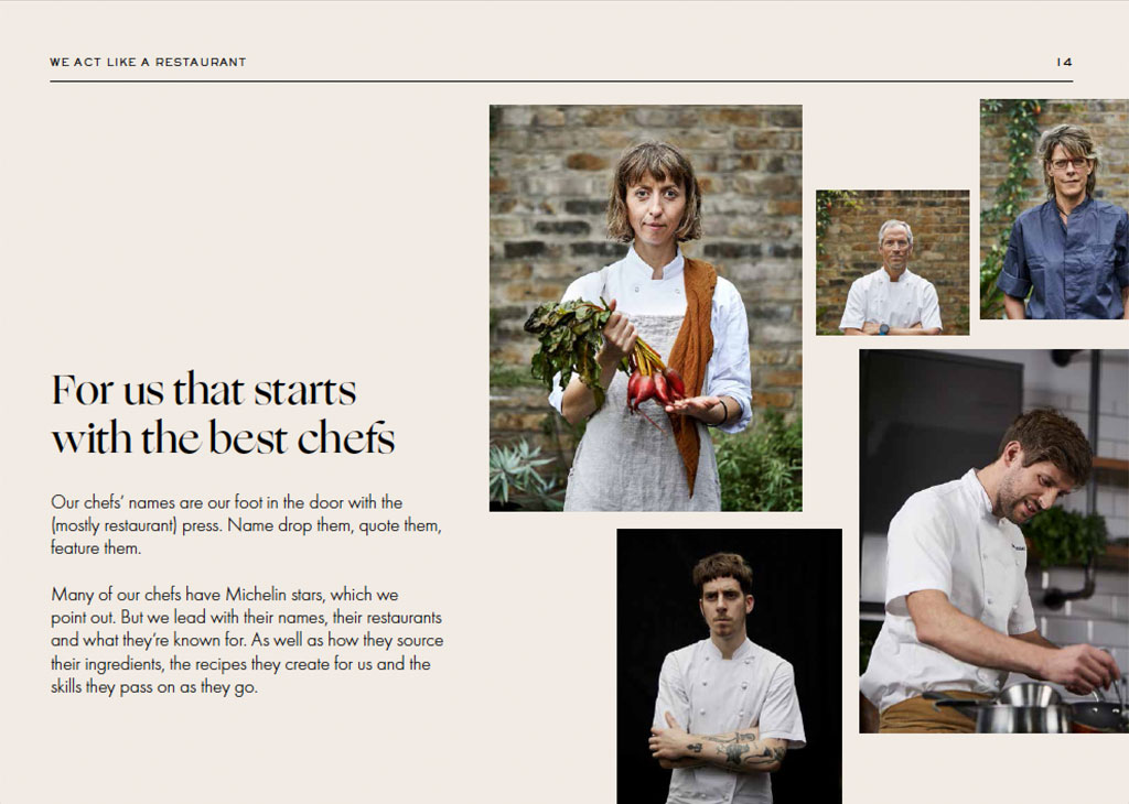
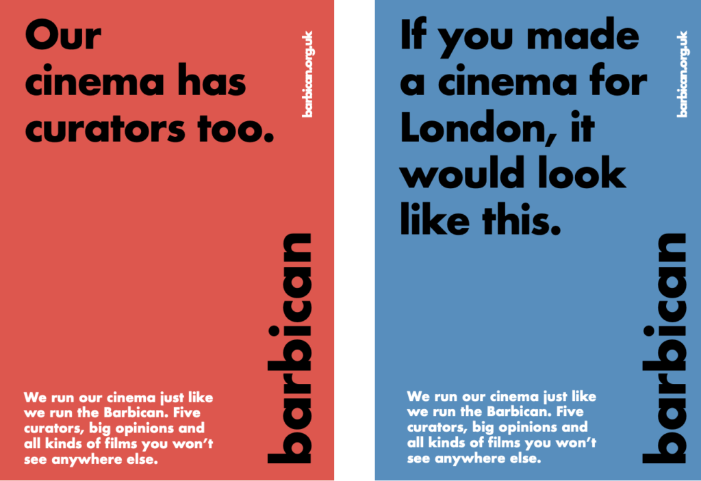
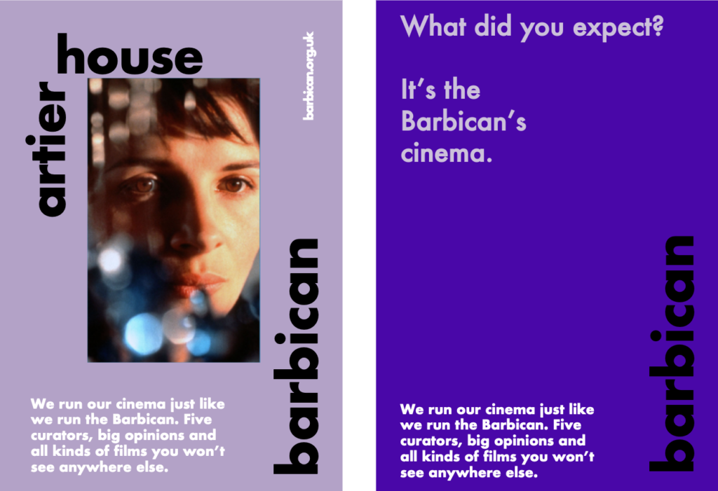
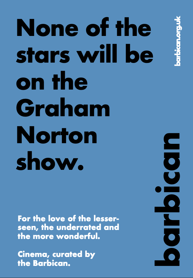
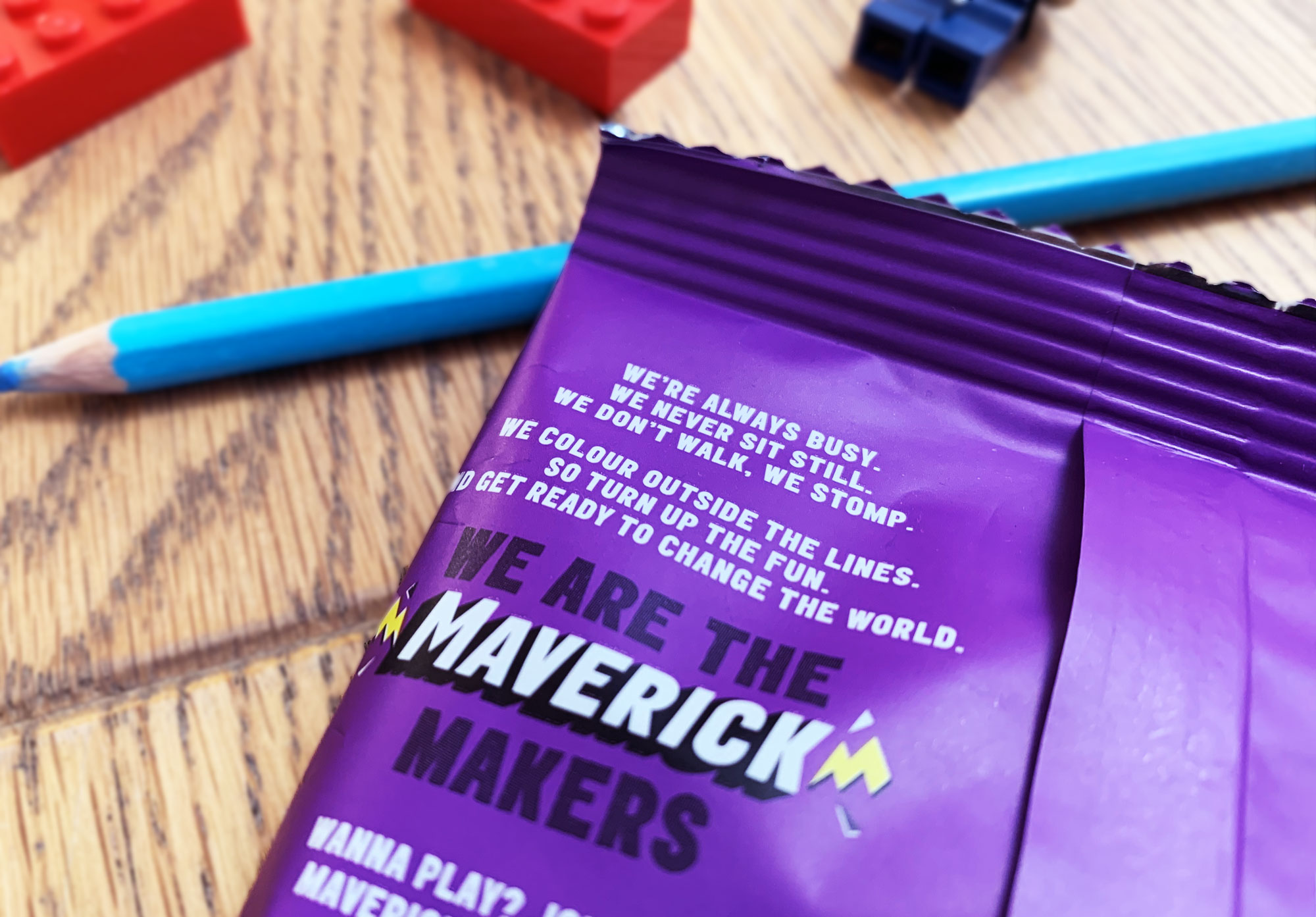
We’ve seen the future and it’s a selfie starring a mum, a dad and some screaming kids with the hashtag #parentingtheshitoutoflife.

But this is no ordinary post from one of your real-life friends (remember them?). This has 32,000 ‘likes’ from some 400,000 followers and counting. It’s A Strange Thing for our times when ordinary people turn their Instagram feeds into an ongoing reality show, starring themselves and their families. And, as is the way with Twitter, Facebook and social media in general, it’s an odd kind of bubble: an echo chamber of people looking at people who look and live like themselves. Like, like, like, like…

This curated slice of real life is cropping up everywhere, especially when it’s lifestyle-y stuff that goes down well on Instagram, like fashion, food and whatnot. It’s also probably where ‘content marketing’ is heading. Ah, ‘content marketing’. There was a bit of hoo-ha in marketing circles (yes, more echo chambers) at the end of last year about whether ‘content marketing’ is ‘proper’. But what happens when ordinary people start getting the kind of attention and interaction that brands’ ‘content marketing’ teams can only dream of?

More on that later. First, here’s a quick peek behind the curtains to introduce you to one couple, who are a good – and popular – example of an Insta-family. Meet @mother_of_daughters, aka Clemmy, midwife, author and mum of four, with her twins:

And here’s @father_of_daughters, aka Simon, Clemmy’s husband:

A photo posted by Simon (@father_of_daughters) on

If you haven’t kept up with these complete strangers’ life stories, we’ll fill you in. Clemmy started her account off the back of a blog about being a midwife. Her husband Simon was (and still is) featured in her posts. But he also set up his own Instagram account and swiftly got even more followers. His shtick, that ‘real men’ love fatherhood is even more of a hit with (mostly) women followers. But it’s together they’ve become A Thing. Between them, they’ve got over half a million followers.

Their Instagram accounts mirror what most of us do on social. It’s mostly everyday stuff – the highs, lows and chaos of daily life – carefully curated. ‘Life-lite’. It’s like reading Hello! magazine about people who don’t live in palaces, but still with a slight glossy filter on top. Even the warts-n-all stuff (for most of us) is curated, no matter how self-consciously. In a lot of similar family-life feeds, there’s often a post about a broken tumble drier just to prove how REAL it all is. Except it’s different, somehow. Most of us don’t get 25,000 likes for posting a picture of some pants on a radiator.

This Instagram gang is tapping into a concocted version of what we want ‘real’ family life to be like – if ‘we’ in this particular bubble is a middle-class mum/dad with the latest UppaBaby and a flat white to go… Many of the @of_daughters duo’s posts look like those mood boards agencies put together to show who their segmentation strategy is aimed at. (They’d be ‘socially-connected-nesters’ or something.) Or a page in a brand’s identity guidelines that says photos ‘shouldn’t look staged’ next to pictures of models pretending not to be in set-up photos.

Like the models in those presentations, the @of_daughters duo is just the right side of photogenic, i.e. good looking, but in a you-could-know-them-way too. They’re not your friends, but they could be. It’s a managed and styled kind of chaos, but they’re doing all the styling themselves.

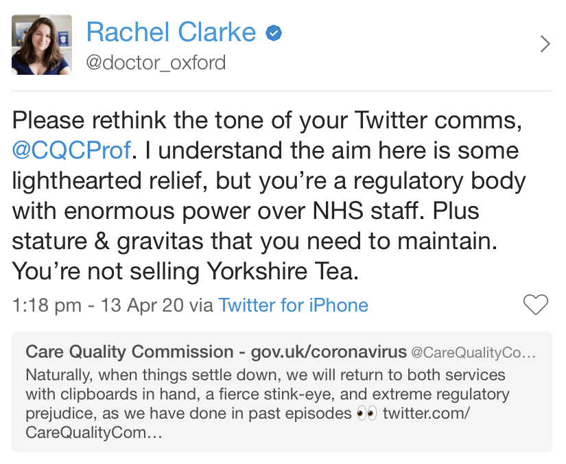
And brands want in. Why? Well, first, although the case is sometimes exaggerated, it’s harder than it used to be for traditional ads to get our attention. We’re all too busy looking at our smartphones.

As technologist, Kevin Kelly said in an interview with the Observer in June:

“The only scarcity we have in this world is human attention. Someone will have to pay me to watch their ad, to read their email. People will be paid different amounts, depending on their influence, their connections, their spending. That is where it is going and that takes out the advertising industry as it exists today. There will still be ads; in fact, I think most of these ads are going to be generated by consumers themselves, by the customers.”

(Tim Wu has just published a book along similar lines too.)

Secondly, brands simply want their stuff to be associated with these people – or as they like to call them, ‘influencers’ – and in front of all their like-minded followers lapping it up.

So how are they doing that? Mostly through product placement. It’s interesting to watch because there’s already a danger of stepping out of the realness (which is what people like) and into that scene from The Truman Show, where Truman’s mum turns to a hidden camera, holding a knife: “It’s a Chef’s Pal. It’s a dicer, grater, peeler, all in one!” The dilemma is when does selling become selling out? Like most things, it works best when people are open about it and say when they’re being paid for something. There’s already a simple convention to put #ad at the end of anything sponsored, and #notsponsored when it’s not. There’s also a third way, which is for Instagrammers to guest star in other stuff, as @dresslikeamum (a fashion blogger who is “changing the bad rep of dressing like a mum”) did when she appeared in a Mamas & Papas catalogue.

But there’s also, what the heck, let’s go Truman Show on everyone:

The week after that video was posted, Simon shaved off his beard in association with a particular shaver including the model name, and a few days after that he wore a new pair of pajamas thanks to another company. Of course, they and other similar Instagrammers want to make a few bob out of their Instagram life – they’ve got a feed and mouths to feed – but it all started to feel too staged.

It’ll be interesting to see if both brands and Instagrammers can get the balance right. It will depend whether these people can get paid for what they do without it noticeably getting in the way of the real life bits. But for all the bumps, this kind of thing makes more sense and feels a more natural fit than a lot of the ‘content marketing’ many brands themselves generate on social. If you look hard enough at those posts, you can hear social media interns scrabbling around the back of the internet, searching for anything – ANYTHING! – to fill that little square and get some likes.

When charity isn't a quick fix

Railway Children
Most children’s charities lead with a photo of a child appealing for your help. We decided to start with something different for Railway Children.

Every marketing department has a sacred cow. In charity fundraising, it’s the image of the doe-eyed child asking you for help. Charities go back to this image again and again because they know it works. But for children’s charity Railway Children, getting kids off the street is only the start. Continue reading

When everything stops

Gail's Christmas Pantry.
Gail’s Christmas Pantry: to keep you going when all the good places shut up shop over Christmas…

When is a Christmas hamper not a Christmas hamper? When you’re Gail’s Bakery and you put together a ‘survival kit’ to see you through the oh-so-slow bit between Christmas and new year. Perfect for those of us (us) whose first-world problems go off the scale when there’s no way to get a perfectly-steamed flat white and a made-by-hand sourdough loaf for toast in the morning. NOWHERE! FOR DAYS!

For when everything stops.
…and you can’t get a decent loaf of bread or coffee.

For When Everything Stops
We branded this and the rest of Gail’s Bakery’s range for Christmas 2016.

We wrote the words for the kits and branded them and the wider range as “Gail’s Christmas Pantry”; Irving & Co made them look good. But the inspiration for the kits came from Gail’s head baker, Roy. Instead of making a Fortnum and Mason style hamper with cognac butter and truffles, he decided to put together all the basic things he wanted – and missed – most over Christmas. The centrepiece is a 2kg sourdough sharing loaf to take to family and friends.

We liked this little anecdote so much we persuaded Gail’s to lead with it rather than the usual ‘here’s our hamper with some bits and bobs in it’. And it’s got Gail’s more Christmas press than they’ve had in years. You’ll probably spot it in a lot of those gift guides you get in magazines and weekend papers. And Vanity Fair already talked about the pandemonium when the kit arrived in their office.

mince-pies

jam

See more of our work for Gail’s Bakery here.

ELDERBROOK: THE NOT SQUASH

The not squash
Call it not-as-dull-as-water, call it a better-for-you cordial, just don’t call it squash.
A new brand and tone for Elderbrook drinks.
Gluten-free, sugar-free, dairy-free, fun-free, free-free… It’s all healthy this and deliciously that at the moment. So what’s a new drinks brand to do to get heard above all the noise, when the cold-pressed brigade are doing a healthier-than-thou thing and even the big sugary drinks brands are singing about joy, happiness, health and ‘choice’? Continue reading

Proof that words make people love you. Probably.

We’ve always been pretty sceptical about the “results” agencies stick at the bottom of case studies or enter into awards. You know the sort of thing: doing x (whether that’s a new tone of voice, rebrand or whatever) has increased sales by 900% and brand awareness by five dog years. Because, as any good statistician will tell you, ‘correlation’ (that something happened) is different to ‘causation’ (especially if, say, ice cream sales went up during a heatwave).

But for once, we have some impressive stats that don’t have anything to do with anyone else – or the weather.

We’ve been working for a company called Utility Warehouse. If you don’t know them, they supply energy, broadband and phones on a single bill for a good price. We’ve been helping their teams write to customers who have questions and complaints. When we started the training back in July we had some resistance, which often happens, especially from people who’ve been somewhere a long time and are used to writing in a set way. But, little by little, we got them on side. The more people we trained, the more our training percolated around the teams. Until, by the end, it was less ‘why should I write differently?’ and more ‘can you help me write differently?’

Now for the stats. Their Net Promoter Score (NPS for short, which measures how likely someone is to recommend a business to a friend or colleague) went up 100% following our training. Chris, the head of their customer service team, sat me down in front of some spreadsheets and explained what was going on. You could actually see the score shoot up from September and then slowly carry on rising to January.

A common concern that comes up in training, especially from people who have targets to meet, is that “writing like this will take much longer”. And the stats backed that up – at first. In September, their teams were writing fewer emails and letters (but at least customers were happier). But then, as they got more confident, the pace went up – too quick at one point as they got too confident – and then levelled out again from December to January. But up they stayed. Chris said that following the training, a team of 30 were writing 240 more emails a day. In pounds and pence that’s equal to the salary of one person. Never mind the NPS scores, the training has paid for itself in output alone.

As I was about to leave, Chris beckoned me back to show me one more thing. A newsletter email had been sent out to customers a week or so ago. And within minutes, a couple of his team emailed him – off their own backs – with suggestions about how to improve it. “That would never have happened before the training”, Chris said. Which shows something that’s almost impossible to measure – good writing changes the way people think about their work too.

One nil to Cambridge

Cambridge University and the city of Dublin both launched brand campaigns this month.
Each of them looks different from ‘the usual’, but if you put them side by side (and put yourself in visitors’ shoes), Cambridge’s campaign is the only one that actually has something to say.
Continue reading

Another slice of panettone: Christmas words for Carluccio's

Another year, another Christmas annual for Carluccio's
Another year, another Christmas annual for Carluccio’s.

Christmas. 'Tis the season to write lots of hackneyed headlines and carol puns (like we just did there). We write Carluccio’s Christmas annual for them every year. We try hard to make it something different each time, without doing anything too obviously Christmassy.

For their 2015 annual, they asked us to write the words for a notebook. They’d already worked with an illustrator, Daniel Haskett, who’d been on a trip around Italy to meet and illustrate their producers for their packaging.

This one's a notebook.
This one’s a notebook…

We themed the annual around ‘beginnings’, showing all the work that goes into handmade chocolates or a box of panettone, long before tinsel appears on Oxford Street.

...themed around beginnings.
…themed around beginnings.

Each little story features sketches – the starting points of illustrations for this year’s packaging.

Starting in January.

IMG_5890_5

IMG_5882_6

and ending in December.
And ending in December.

Look out for our Christmas words for Gail’s Bakery coming to a posh part of London – possibly near you – too.

No bluffing: our how-to guides

Like method actors, one of the first things we’re asked is “so what’s your process?”. People like process; it’s comforting. It means everyone knows the steps involved to get the perfect piece of work.

But there isn’t a one-size-fits-all, ten-steps-to-success way to do branding. If anything, we’ve found that process gets in the way and causes the most problems (and the bigger the company, the more process clogs things up).

We’ve been thinking about this because we’ve written a series of how-to guides to help demystify what we do and share what we’ve learned over the years. We found that it’s far easier to explain how not to get bogged down in process than it is to explain what to do instead. And the knock-on effect of stripping away a process means explaining how we do what we do sounds really simple – far simpler than it really is. Maybe that’s why lots of agencies call things like briefing meetings, research and interviews ‘immersion phases’ – because it sounds too simple to say what really goes on.

But actually using your wits and changing the way you work to fit the project and the brief is far harder than working to a process. We think it’s the only way to get good work. So we’ve stuck to our guns and told it like it is.

Update:
We posted our first how-to guide about tone of voice here on our blog. We’ve moved it to a new section on our website, where you’ll find all our how-to guides: over here.

Made in Britain: 2014 via 1950

Last weekend we went to Best of Britannia (BOB), part pop-up department store, part celebration of independent brands designing and making things in Britain. On top of ideas for Christmas presents, it made us think a lot about ‘brand Britain’. Many companies at BOB were selling an idea and image of Britain as well as their wares.

The main atrium at Best of Britannia
The main atrium at Best of Britannia – your country needs you etc. etc.

A selection of the brand and products on sale.
Some of the brands hanging out at BOB.

A lot of products harked back to a ‘when Britannia ruled the waves’ past. Maybe it’s a hipster thing, but screen out the iPhones and you could’ve been in 1950.

Britannia rules footwear again?

Going back in time
Cycling back in time.

Children's clothes Michael Gove would approve of.
Children’s clothes that would get an A* from Michael Gove.

It’s going on outside BOB too, especially in beard-tastic menswear — from high-end shoes like Grenson to high-street edits like Topman General Store with a stop for a trim at somewhere like Murdock en route. Why it’s become ‘A Thing’, we’re not sure. A lot of the look is frozen at a point just before British industry went into decline. As if bringing some of that back will rewind things to the time of the Empire again (there were a lot of Union flags on show). Or maybe we’re over analysing it and we just want to hark back to a simpler time before ‘fast fashion’ and when clothes lasted longer than one season.

Almost all the brands at BOB were riffing on a certain kind of manufacturing too: ‘craft’ was mentioned a lot. Probably because they have to. The prices were very much not stuck in 1950.

Primark it ain't. These shoes cost £299. They're handmade from a single piece of leather.
Primark it ain’t. These shoes cost £299. They’re handmade from a single piece of leather.

We’ve all got so used to cheap sweatshop prices it’s hard to stomach the ‘real’ cost of things made in Britain, beautiful and handmade though they are. There were exceptions. Some of the children’s brands weren’t completely out of reach for most people, like Immink and When We Were Little . We were also interested to talk to someone from new casual brand Born British whose hoodies and t-shirts are priced close to Nike’s (Born British just make a smaller profit each time). But nearly everything else was very high-end. A reminder that the Made In Britain stamp has become luxury for a few.

One last footnote to all this was that while the event and brands were beautifully presented, the government’s Department for Trade and Investment ‘GREAT’ British campaign looked embarrassingly out of place.

The DTI's brand for Britain: time for a Great Rethink.
The DTI’s brand for Britain: time for a Great Rethink. They could do with a bit of craft themselves.

The problem with management books

Jill Lepore’s take-down of ‘The Innovator’s Dilemma’ by Clayton M. Christensen (a management book popular with Silicon Valley types) in the New Yorker is worth a read — all 6,000 words of it.

Here’s a (bit of a chewy) taster:

“Disruptive innovation as a theory of change is meant to serve both as a chronicle of the past (this has happened) and as a model for the future (it will keep happening). The strength of a prediction made from a model depends on the quality of the historical evidence and on the reliability of the methods used to gather and interpret it. Historical analysis proceeds from certain conditions regarding proof. None of these conditions have been met.”

That’s pretty much the crux of Jill Lepore’s argument. It’s also the the big flaw with pretty much every management book in the ‘must read’ section of airport bookshops (and, for that matter, every big idea sold for squillions by McKinsey). Because business school theories all work the same way. They start with a grand but simple idea that explains why all businesses succeed or fail, then carefully pick a bunch of case studies to conveniently fit their theory. And they ignore the rest.

Management books can sometimes help you spot trends. But — and here’s the important bit — all those theories are rubbish at helping you repeat companies’ successes (or even predict what will succeed in the future). De-constructing why something has been successful and turning that into a process is very, very different from actually doing something successful. If it were that easy we’d all be billionaires by now.

About the only thing you can be sure of is that all the ‘innovative’ successes these tomes cite started out with a good idea and a better way to do something, not with an over-simplified theory from Harvard Business School.

Strategists! Step away from the acoustic guitar

Here’s what I want from Airbnb. I want a website and app that work beautifully. I want to find an apartment so I can pretend I live in Brooklyn (even if it’s just for a week). And I want to make a few quid from my own apartment on the side.

Here’s what I don’t want. A “New Airbnb,” a logo with a cutesy name and a “belong anywhere” brand story. A week on from all the hoo-ha, I don’t mind whether you love Airbnb’s logo or whether you think it looks like a vagina. It’s the stuff around the rebrand that bothers me.

The ‘new Airbnb’ in a couple of words.

Their symbol ‘stands for four things.’

A grandiose launch seems enough to make most people believe the hype and convince themselves that Airbnb’s brand is now “more than a logo.” I’m not so sure. Because beyond the logo there isn’t much there.

They’ve made a film about it, “the story of a symbol of belonging”:

I don’t know what’s more depressing, that as brands get bigger, they all feel the need to dress up what they do with quasi-philosophy, or that no-one seems to have noticed what a load of cobblers it is. I think otherwise sane people in branding have become so desensitised to watching cartoons with a strumming acoustic guitar soundtrack, that they don’t actually read the “We are all yearning for a sense of place” words anymore.

In case you don’t have time to watch Airbnb’s little film, I’ll bring you up to speed. It tells the story of their new symbol, which has been given (and I’m not making this up) a name. It’s called the Bélo (with an accent on the e because that sounds foreign if you’re not French), and apparently it stands for four things: people, places, love (three random, over-used words) and Airbnb itself. Their website tells us:

“belonging has always been a fundamental driver of humankind.”

Meanwhile, Airbnb’s CEO, Brian Chesky, says their logo is

“an iconic marque for our windows, our doors and our shared values.”

Ay?

Brands and agencies seem to be part of a merry dance to churn out more and more of this stuff, as if the bigger and broader the statements, the more profound (and important) brands automatically become. What actually happens is that everyone starts gravitating to the same boring branding words. Every brand is “sharing” x, y and z, and we’re all “connected” to something. The Stereo MCs were way ahead of their time.

I put a lot of the blame for this stuff at the door of strategists, planners and brand executives who seem to think that branding is “more than a logo” which means creating a logo and coming up with a lot of puffed-up nonsense to justify it. It’s hot air.

Of course, it could be that the Bélo back story is just PR spin, which got the internet’s attention, for sure, but then there’s nothing the internet likes more than a rebrand of one of its own. If that’s the case, the new logo’s just a simple mark (albeit one with a token “you can design your own logo” bit tacked on). If that smartens up Airbnb and makes it look less like a start-up, fine. Just don’t believe the hype.

I like Airbnb, I really do. I like how simple it is. You can explain it to someone in ten seconds. The problem is that all the people, places, love bleurgh is over-thought and complicates it. Somehow “belong anywhere” doesn’t feel like it belongs to Airbnb at all.

A version of this blog post was also published by It’s Nice That.

Something wonderful in Frome

An uphill cycle race, a proposal to turn the town into an obstacle course, an art gallery and cafe in a loo, mysterious slogans graffitied on walls and pulled along by airplanes. Welcome to The Independent State of Frome.

Froomies voted 'yes'
Froomies voted ‘yes’.

Since we worked on the branding project for Shrewsbury, we’ve been on the lookout for other British market towns getting things right. And it turns out Frome (say Froome like room or Chris) has got it going on. The Times declared it one of the coolest towns in Britain last year, so clearly we’re late to the party, but with all the talk of the death of the High Street and a lot of same-y market towns desperate to get Mary Portas on side, it’s worth heading south west to see what they’re up to.

Frome’s slogan by Ruth Proctor. All over the town and in the sky.

Now get the T-Shirt. Part of a project by Foregound Projects.

Only a decade ago there were dozens of boarded up shops – says The Times – and now there’s a waiting list to get a shop on Catherine Hill.

So what changed? And what can other towns learn from Frome?

Well, the people of Frome seem to be the biggest part of it. The residents took over running the council from the Liberal Democrats in 2011. But, as this blog written by a local points out, that’s only half the story, and changes were rumbling earlier than that. (Babington House down the road probably didn’t do any harm either.)

Proposals for Frome by Peter Liversidge.

Possibly the thing to take from Frome is that they didn’t start out with a ‘destination branding strategy’. Most of its success is down to a few go-getting people turning Frome into the sort of town they’d like to live and work in: independent shops (tick); a good market (tick); lots of arty and sparky things to do (tick); a hot-rod-themed coffee place that serves a proper Flat White (tick tick). That’s just for starters. And not surprisingly, it’s most people’s idea of a good market town too.

A proposal to build an obstacle course in the centre of Frome.

If you look at towns that punch above their weight in Britain, it’s often one person or a small group of people that gets things going. Richard Booth led the way for Hay-on-Wye to become a town of books. Rob Hopkins ventured to make Totnes the first transition town.

Most places trying to get on the map would do well to follow their lead. Think small, find a few people to get things off the ground and don’t try to please everyone. Don’t do it the old way, basically: 99.9% of place branding (or whatever you want to call it) projects go through endless workshops to keep everyone happy and then end up with a vague ‘One this’, ‘your that’, ‘uniquely x, y and z’ line that could apply to any town, anywhere.

What not to do: StaffordSheerlyNot

Not Frome. It’s just starting to make its mark and from the outside, it’s working.

' Find your happy ' makes us sad

At first glance it looks normal. It looks like a line. It sounds like a line. It reads like a line.

Kind of.

Because it isn’t normal at all. It’s been brandified.


‘Find your happy’. You can see how they got there. Rightmove is all about finding a home, but research probably told them that moving house is an emotive time (“find your stress” might be more appropriate). So they’ve mushed that research into a line and swapped homes for happiness. Happy is now promoted to a noun, a thing you can get from the App Store.

The marketing team likes it because it’s campaignable and internal comms love it because the people who work there can write what makes them happy in marker pen.

But nobody, not even Pharrell Williams with his “if you feel like a room without a roof” spiel says “Has anyone seen my happy? I’ve put it down somewhere.” It’s nonsense. Looks like a line, but isn’t.

It keeps happening. Here’s an ad campaign for Travelodge that’s turned the humble ‘weekend’ into a verb.

Travelodge ad
 

As if it’d be perfectly normal to say things like ‘let’s go weekending’. Ugh.

Back to house hunting again, here’s Zoopla turning the word ‘smart’ into a person:

Zoopla: smart is always the first to know
 

It’s not just that these lines sound silly when you say them aloud, which we’d say is reason enough to get out the red pen. It’s that the words at the heart of each campaign – ‘happy’, ‘weekend’, ‘smart’ are so banal. And literal: how can we say smart? Write ‘smart’. Happy? Write ‘happy’. Unpick them and it becomes even more obvious that there’s nothing there – ‘if you find your home you’ll be happy’; ‘everyone likes weekends’; ‘smart people use Zoopla’. They sound like the very first brief.

These brands haven’t moved words around to push the limits of the English language – it’s not exactly Eimear McBride – but to cover up that there wasn’t much of an idea to start with. It’s the sort of thing strategists and planners unwittingly do all the time when they write brand positioning presentations and the like. Maybe marketing people have got so used to reading branding nonsense that they can’t spot a genuinely smart idea from a line with the word ‘smart’ in it.

David Abbott, we miss you already.

The Turing Test for brands

In 1950, computer scientist Alan Turing came up with a test for artificial intelligence; what became known as The Turing Test. Could people tell if a machine or a person was ‘talking’ to them? If a computer could fool someone into thinking there was a person in charge, it passed the test.

We’ve ctrl-alt-deleted the Turing Test and turned it upside down for brands in 2014. Can they leave their ad campaigns, brand diagrams and slogans behind to stop writing like robots when they talk to customers? Are there any real people behind the brands?

Sports brands are a good test bed for our experiment. They’re a curious lot when it comes to writing. It’s all high-fives, big name endorsements and ‘go-get-em’ tiger determination. It’s become their default way of writing so it’s hard to think back to when it wasn’t always this shouty testosterone fest.

But that all changed in 1988 when Wieden and Kennedy came up with this slogan for Nike:

These three words set the tone.

One year later, Adidas was all macho headlines (but with lots. of. full stops too). And, 25 years on, not much has changed. Put Asics, Reebok, Nike and Adidas on the same pitch and they’re all coaches screaming pithy, punchy phrases from the sidelines.

Flashforward to 2014: it's gung-ho, nothing's gonna stop you, be the best you can be, ya-da-ya-da...
Flashforward to 2014: it’s gung-ho, nothing’s gonna stop you, be the best you can be, ya-da-ya-da…

Even Sochi’s Winter Olympics has a weird, badly-translated slogan of its own.

Campaigns in the windows of Nike Town and at the Olympics are all very well, but what happens to the way sports brands write on Twitter? Does their tone change when they’re talking to mere mortals in trainers?

Erm, no. It’s still faster, higher, stronger, better, more, more, MORE.

They’re a tiring read. They sound like robots, and it’s hard to spot any people behind the words.

Compare this to real people writing about sport on Twitter (beyond those annoying updates telling the world how many miles they’ve run) and things get a bit more realistic.

Granted, these people are writers as well as runners, but they’re giving the warts n all version of their runs.

So what happens when the two meet and sporty brands talk to the real people on twitter (after all, that’s what it’s all about)?

Nothing changes. More full-throttle tweets. They just do it, and do it and do it.

In a way, you’ve got to admire how consistent they are. Every Tweet sounds like a Nike sports slogan or ad. But they’re also very weird. It’s odd to be that full-on all the time. It’s more like a script than a two-way conversation.

So back to our experiment: if pushed, could they change? Could we find a real person in the team tracksuit? We put Nike to the test, to see what would happen when we asked them a tricky (and true) running question. Our own Turing Test for brands.

Their gung-ho answer came back as fast as Rafael Nadal’s serve…

…but as advice goes, it wasn’t practical and, more importantly, it’s unsafe. You could injure a young baby doing that.

In true Nike style, though, we didn’t give up (if runners never quit, neither do writers), and asked them again.

But all we got this time was silence. The coach had left the building.

This post was sparked by a talk we did at the launch of Like The Wind, a beautiful new magazine for runners.

#Hashtags: home of the lame joke

Hashtags started out on Twitter as a useful way to tag topics, so others could search for and add to the conversation. Think of the times Twitter has come into its own, like the #Arabspring or the #londonriots. When hashtags are done well, they’re really useful. But that’s becoming increasingly rare. Mostly they’ve gone the way of emoticons: overused (as parodied by Jimmy Fallon and Justin Timberlake last week) and pretty lame.

Twitter has put together some basic tips to help people use hashtags better, but we don’t think they go anyway near far enough. Here’s what we’d add.

A We All Need Words # style guide:

Tag along.

Why brands need to stop going on about 'content' and find something worth saying

We came across our first ‘content strategy’ just after we started We All Need Words. A planning agency had been hired by a big (non-sporty) brand to sponsor the sort of sports events that Nike do. Their twist on this was to support the spectators – the families and friends who go along to things, taxi their loved ones to events and put up with all the training in between. So far, so good – ish. But what we soon realised was that the planning agency and its client hadn’t got anything to say. At all.

‘We just need you to write the content’ they said, showing us sheets and sheets of blank ‘wireframes’ (internet speak for pages without any content in them). We sometimes think back and shudder about one big area they’d earmarked on their wireframe with the title ‘making banners’. We remember the creative director talking about his grand plans for a step-by-step video with annotated instructions, and lots of ‘share’ buttons underneath it, just in case it went viral. After probing him about what it’d say and who would read it, he tried at first to explain ‘We’ll tell people that you need a big sheet, and paint some words on it’ before saying… ‘but that’s your job!’ and moving on to another blank wireframe.

As it turned out, the website wasn’t the viral success they’d hoped for. The big brand fell on hard times and stopped sponsoring sports events. Oh and the creative director is still advising his clients about content strategies.

So what went wrong? It wasn’t necessarily that this big brand and the sport event weren’t a great match. It’s that they’d started with a vague idea before they thought what – if anything – they had to say about it. It’s the problem that plagues most ‘content strategies’ that come our way.

It’s not an easy hurdle to get over. Big brands are at an immediate disadvantage to traditional publishers of content (like journalists) and social media (like bloggers). For one thing, brands can’t just write about things people want to read; they need to find things to say that cast them in a good light. And then there’s customer scepticism to get over too. Who’s really going to take fashion tips from a high street clothes shop at face value? Especially if they can get better – and unbiased – advice from a magazine or blog.

One way brands try to get around creating content is to give up altogether and sponsor or buy other people’s content. Here’s Thom Yorke from Radiohead in the Guardian earlier this year:

“We started having meetings where people started talking about what we did as ‘content’. They would show us letters from big media companies offering us millions in some mobile phone deal or whatever it was, and they would say all they need is some content. I was like, what is this ‘content’ which you describe? Just a filling of time and space with stuff, emotion, so you can sell it?”

You can instantly hear how odd the idea of ‘content’ is when you start talking about it as this abstract thing you want to create or buy. Even the word ‘content’ is weird when you think about it. That sentence was content. As is this one. ‘Haddock is most commonly found at depths of 40 to 133 m (130 to 436 ft), but has a range as deep as 300 m (980 ft)’ Wikipedia is swimming in the stuff. Apps and TV shows are called content. We’re told by search engine experts that Google’s algorithm looks for ‘fresh’ content – it doesn’t matter what, as long as you’re saying something new. But it’s easy to come up with ‘content’. It’s much harder to create any that people want.

Yet helping brands create content people want is what we’re doing for clients more and more. Even when we’re officially working on a ‘tone of voice’ project, we’re usually doing a branding project on the sly: going back to innocuous, fluffy brand statements, interrogating them, figuring out what their stance is and using that stance to make all their words better.

Then, when a client asks us for help with content – which in our case usually involves writing of some sort – we ask them to compare what they have to say with all the blogs, magazine articles, Facebook posts (and so on) out there. And if they can’t do it better, don’t bother.

We’ve been in countless meetings with clients from vodka brands to property developers who’ve asked us to help them write about the latest cool bars and restaurants in London. To which we’ve always told them the same thing: although we’d love to eat out on their account, it’s foolhardy to try to compete with magazines and a thousand bloggers Instagramming their dinners every night.

This is probably seen as radical heresy to some, especially those with ‘content manager’ in their job titles, but we don’t think all brands need to become part-time publishers. There’s a confidence about brands that don’t get into the Twitter and Facebook fray or that don’t feel the need to think up things to say and email them to you every week.

The other thing we ask clients to do is to look at things that are popular and why they work. So, when we’re helping clients with social media (which, by the way we, like everyone else, are still figuring out how to do well), we look to the people who get lots of likes or retweets. And a quick survey shows that they’re not asking open-ended questions about the weekend or making endless positive statements about the hot weather.

Only brands do that. Popular people on Twitter etc are cynical. They say what they like and don’t like – and if they haven’t got anything to say, they shut up. This would be a much better content strategy mantra for most brands to follow than ‘starting conversations’.

The one thing we aren’t doing is just creating ‘content’. Anyone can do that. Maybe a simple definition change would help: try swapping ‘content’ for ‘opinion’ and see if you’ve still got something to say.

Wild Lime Bar & Kitchen

Move over All Bar One, Slug and Lettuce and JD Wetherspoon. A new high street bar brand is in town.

High street pubs – especially those outside London – haven’t moved on much since the mid-nineties. Chains like All Bar One, Pitcher & Piano and Slug & Lettuce have struggled to reinvent their formula of candles on bare-wood tables and pub fare. And JD Wetherspoon still dominates thanks to its size, its you-know-what-you’re-going-to-get familiarity and low prices.

Enter Wild Lime Bar & Kitchen – a bar with a bit of New World attitude about it, and inspired by laidback places like California, Cape Town and Sydney. We came up with the brand, the name and all the words. & SMITH were behind the design and art directed the photography.

The first pilot has just opened in Southampton, and two more are about to open in Banbury and Reading.


We’d like to do more branding projects like this: coming up with the idea for the brand as well as the words. And teaming up with designers like & SMITH, as we did on both this project and on the work we did for Shrewsbury last year.

Shrewsbury nominated for D&AD pencil

The branding work we did for Shrewsbury with & SMITH last year has won a D&AD award. Shrewsbury is the only branding scheme nominated for a D&AD pencil in its category (just nudging ahead of London 2012’s Olympic branding, no less).


Read all about Shrewsbury here – then go there.

Who wrote it? I did

We’ve noticed something. Behind a lot of brands with good writing, there’s a founder who penned the words themselves. Someone who had a clear idea of what they wanted to do, knew who they wanted to be and how they wanted to sound. It goes to show that good writing and clear thinking are one and the same.

Dishoom

We’ve been meaning to try Dishoom for a while, so last week we went to their restaurant in Shoreditch (there’s one in Covent Garden too). Right away, everything felt really well thought-through (and pretty slick, too). From the overall idea – it describes itself as ‘a Bombay cafe in London’ – to the food, the music and the sparky words on their menu.


We know how hard it is to write a good menu. There’s not a lot of space, and you have to balance some personality with getting information over quickly. Most do one or the other, but this does both well. So we asked the manager about their words. Who wrote them? Was it a branding company? Or maybe a writer we already know? It turned out one of the founders had written it himself.*

There’s more. Other brands with words written by their founders:

Stutterheim

Here’s the brochure from Stutterheim, our favourite if-only-we-could-afford-them Swedish raincoat company. Words by Alexander Stutterheim himself:


Most companies are obsessed with sounding ‘positive’ (it pops up in briefs we get all the time). Stutterheim’s idea – ‘Swedish melancholy at its driest’ – sets the tone for everything they write and design.

Help Remedies

helpremedies

Who says pharmaceutical products can’t have beautiful branding? The co-founders of US-based Help Remedies worked together on their simple packaging – both of them used to work in branding and advertising.

Howies


Another ex ad-man, David Hieatt set the tone for howies a long time ago. He’s a good writer. But he left howies (and went on to start Hiut Denim, where he, the founder, pens the words again). The interesting thing about howies is that the spirit of David’s style stayed after he’d gone. Years later, the commercial director, the web team and their creative team all write in the howies way. David’s style stuck. Not through a big fat guideline that nobody read, but because howies are clear about what they stand for, and everyone who works for them gets what they’re about.

Peppersmith

Peppersmith has a simple idea: chewing gum made from natural ingredients. And the words are as smart as the packaging (with a slip of paper for you to put your chewed gum in).

&nsbp;
 

The founders of Peppersmith used to work at Innocent, the patron saint of blog posts about brand writing. And while Innocent’s creative director, Dan Germain, wasn’t one of the founders, he did work with them from the very beginning. Everyone else followed his wordy example, learning as the company grew, and as they left to set up their own companies.

That’s not to say all founders are good writers, or that you have to be. But good words and a good idea do go hand in hand. Writing is a good discipline: it forces you to keep your ideas tight.

* Since we wrote this, Shamil Thakrar, the founder of Dishoom, got in touch with us to say that although he wrote the original menu and many of the words on the website, this latest menu was written by Elise Valmorbida (and Shamil edited it). We stand corrected, as does the manager of Dishoom Shoreditch! Nice work, Elise.

Writing for social media: our theory to add to the theories

‘How should our brand write for Facebook, Twitter and [insert the next big thing here]?’ That’s a question nervous brand managers ask us a lot at the moment.

To their slight dismay, we don’t hand over a template, a guideline or a guaranteed-to-get-you-more-retweets-than-that-photo-of-Barack-and-Michelle trade secret. Because social media is different to other writing. You’re talking to people, so it’s even more important to sound like a real person when you write.

It’s probably no surprise that the best brands’ Twitter accounts often just have one person writing their updates. And they don’t just understand the brand they’re writing for, they put their own personality into the words too:

This is a hard lesson for old-school branding folk to get their heads around because it’s almost impossible to replicate or neatly slot into a template.

But that’s not all. We’ve noticed that the more brands go off on tangents or say things that don’t necessarily sound ‘on-brand’, the more people warm to them.

Like? There’s more.

Ten signs a copywriter is on autopilot

It’s easy to blame bad writing on cautious clients or the scars of two-thousand-and-one track changes. But much of the blame has to lie with copywriters themselves. Too many of them have knocked out sloppy words for far too long.

We want it to stop. So we’ve written, not rules exactly, but provocations. What if we rip up the lazy clichés and hold people who write words for a living (including us) to account? So writers can’t hide a weak idea behind stylistic tricks or coast when they think a client won’t notice, or the deadline is tight.

Let’s stop the rot and get out of this rut.

1. Style is a crutch.
Don’t use style to cover up the fact that there isn’t anything to say. It never works. Pick a great ad from 1962 to 2012 and, nine times out of ten, the words are simple. Mundane, even. It’s about coming up with a tight idea and finding the best way to say it. Simple words (trick-free) nearly always do the job better.

2. “If it sounds like writing, I rewrite it.”
Elmore Leonard’s right. Just as drama school kids overact, copywriters ‘overwrite’, adding flourishes to show off. But every time you draw attention to your writing, you get in the way. It’s the copywriter’s job to be read, not heard.

3. Sometimes commas are in the wrong place. Get over it.
Why do pedants fixate on punctuation and grammar over whether the words are any good? It’s easier to fix a stray apostrophe than a weak idea.

4. Write like you really speak.
Innocent drinks (unfairly) get most of the flak for wackaging, the cloying matey tone favoured by banks and fizzy drinks. On his blog last year, writer Nick Asbury asked whether we’re fed up of brands trying to sound like people. We think the problem is simpler: brands don’t sound anything like real people. Only a packet of crisps would say they’re Bloomin’ marvellous value for money. It’s fake. And only copywriters (or Enid Blyton) write blimey and crikey. Stop it.

5. Never trust a writer who says they’re a ‘storyteller’.
We write things for a living which means storytelling comes with the job. So what is it with copywriters and their need to bang on about stories? We’ve got a theory that copywriters who talk about stories are failed poets or would-be authors. It would explain all the bad novellas on boxes of cereal and bottles of whisky.

6. Say it directly or don’t say it at all.
‘At Big Bank inc. we…’ So many corporates start with this sentence. Why not just ‘We’? It’s the same with ‘We aim to’ or ‘We believe’. We’ll believe you if you do it, so say what you’re going to do.

7. Clunky segues are a warning sign.
‘How?’
‘Why?’
‘That’s why…’
Not only are these some of the most lazy lines in all of copywriting-dom, they’re also a sure sign that a writer is trying – and failing – to shove two unrelated ideas together.

8. The. Lazy. Shortcut.
Stringing three bland words together with full stops doesn’t make a headline.

9. Microsoft Word gives you verbal diarrhoea.
Don’t write words for websites, packaging or anything where layout matters, without sketching them out first. Otherwise you’ll write the Encyclopaedia Britannica when a few words or an image will do the job better. ‘Welcome to our website’ is a good (bad) example of the sort of words that should never be on homepages ever again.

10. The fake testimonial. Oh the shame.
“It was a wonderful shopping experience and I wouldn’t hesitate to recommend it.” Did they really say that?

No, I don't want to see your brand dodecahedron

Brand strategy has puffed itself up to be so important it’s put on a pedestal, and it’s high time we knocked it off. Let’s drop the diagrams and faux-strategy once and for all.

We’ve all been there. Brand presentations that take about three-and-a-half days to go through. The first part often goes over that particular agency’s or client’s take on branding. In this bit, they’ll tell you that it isn’t about slapping a logo on everything. It’s much, much more than that. They’ll probably have a SillyGrandioseLabel® for what they do, which sums up what branding is, just with a ™ on the end. 500 insights, activation plans, and all manner of shapes (triangles, keys, doughnuts, onions) later… you get a ‘proposition’ that’s ‘not for external use’ and is so broad you could recycle it for any other brand. If a good product, service or idea comes off the back of these soupy strategies, it’s a miracle. Or the strategy’s post-rationalised to fit it.

It goes on, and so could I, but I’ll spare you. The question to ask is whether it’s too late to do something about it Because most companies have built their marketing departments on this brand slop. There are proposition managers, insight specialists and customer loyalty executives a-go-go. So it’s hard to change, even if clients really want to and think they can.

If a strategy’s written really clearly, in ‘normal’ words (and this is rare in itself), things still go wrong. Yes, the client says, you’ve nailed it. Now I get it. Thanks very much. But then it gets lost in the machine. Or emailed to thirty people who all tinker with it. And the less sure a brand is about who they are, the more this happens. Because as you peel back the layers of brand onions, you find that the big ideas everyone bangs on about aren’t as big they make them out to be. People feel more comfortable making branding and strategy fuzzy. It’s become the default.

I’ve realised that writing strategies in simpler words will only ever get you so far. You see, the problem isn’t really about ‘jargon’ or clearer writing at all. It’s more that strategy has become this strange separate thing, buzzing about in its own little orbit. And we need to bring it back down to earth.

Part of this is about changing how consultancies work, so they follow more of an ad agency model, where designers and writers pair up to do the thinking at the same time as everything else. So instead of starting with ‘brand stories’ or ‘propositions’, skip to the doing bit and ask: how would that work on a phone, what would a shop or event feel like? What would the product or service look like? How would it sound? What else would go on around it? So when it’s presented to clients, there’s a short summary of the overall idea – still in normal words – but with lots more examples of how it works in practice. Things to see. Stuff to read. It means the strategic bit isn’t this abstract thing trapped in a perpetual PowerPoint presentation. And the big ‘ta-dah’ moment isn’t just a logo on a screen either, or three words describing a tone of voice.

Sparky ideas, clear strategies, design magic and word wizardry all in one go. We could even call it brand alchemy, brand wonderment or brand lucidity, but then again, no.

This post was also in Design Week.

What's the big idea?

Branding types love to talk about ‘the big idea’: a thought that makes you feel differently about something or see things in a new way. But most so-called big ideas aren’t really that big and they don’t have much of an idea behind them either. It’s much easier to come up with touchy-feely slogans than it is to create something with real sticking power. A lot of big ideas are just froth.

But every now and then a big idea pops up as if out of nowhere, like ‘The 99%’ from the Occupy movement. It gets to the point of ‘you and me versus the super-rich’ so neatly that it’s almost impossible to skirt around the the subject of wealth and inequality without using it.


Apologise unreservedly seems to be the hardest word(s)

Oh dear. Diageo have got themselves in a bit of bother with small brewers BrewDog. You only need to look at Diageo’s apology to see how they got into trouble in the first place (and why BrewDog deserve to win more awards than them).

Diageo’s at-arm’s-length statement vs…
A Diageo spokesperson: “There was a serious misjudgement by Diageo staff at the awards dinner on Sunday evening in relation to the Bar Operator of the Year Award, which does not reflect in any way Diageo’s corporate values and behaviour. We would like to apologise unreservedly to BrewDog and to the British Institute of Innkeeping for this error of judgement and we will be contacting both organisations imminently to express our regret for this unfortunate incident.” (Read the rest here.)

…BrewDog’s feisty blog
Once you cut through the glam veneer of pseudo corporate responsibility this incident shows them to be a band of dishonest hammerheads and dumb ass corporate freaks. No soul and no morals, with the integrity of a rabid dog and the style of a wart hog. Perhaps more tellingly it is an unwitting microcosm for just how the beer industry is changing and just how scared and jealous the gimp-like establishment are of the craft beer revolutionaries.
We would advise them to drink some craft beer. To taste the hops and live the dream. It is hard to be a judas goat when you are drinking a Punk IPA. (Read the rest here.)

Obviously this has turned into great PR for BrewDog. Good on them, we say. There are many more things we could say about Diageo’s handling of this (except Diageo won’t let us comment on their site). But their corporate words alone speak volumes. No one at Diageo is accepting responsibility. It’s all ‘corporate values and behaviour’. They can’t even say sorry without wrapping it up in ‘to express our regret for this unfortunate incident’ formality. BrewDog’s blog, on the other hand, isn’t just written more like a real person, it oozes personality. It sounds like them and their Punk IPAs.

Diageo probably hope that their anonymous formal statement will help contain the bad PR, but all it’s really doing is playing to BrewDog’s David vs Goliath story. It’s hamming up their role as the villain of the piece. They may as well issue a photo of a shadowy figure with a twirly moustache and cigar for all the good their corporate statement does.

When small independents learn big companies' tricks

As of today the contents of my fridge have changed. Bye-bye big name labels and uniform vegetables. Hello real food delivered from local shops by Hubbub. If you haven’t come across them already, Hubbub is roughly what you get when you cross the good bits of buying local with the convenience of ordering from Ocado. It’s as good as it sounds.

It’s a fridge-lightbulb moment for me because the convenience (right down to Hubbub’s one-hour delivery slots) paired with the quality is so much better than what I’m used to. Imagine if all shopping was this good… Now of course it could be that I’m alone in thinking this, living in a deluded metropolitan bubble of farmers’ markets and heritage tomatoes. But could the scales be tipping from big unwieldy companies to smaller independent ones?

Judging by what’s happening at Tesco, it might well be. Until Christmas, Tesco’s growth seemed unstoppable. That was until their ‘Big Price Drop’ campaign flopped and they suffered their worst Christmas in decades. And last month they saw their market share fall to 29.7%, the lowest for almost seven years. As we’ve talked about before, big companies have got being big down to a tee. They know all about using their muscle to cut production and distribution costs. But it’s as if they’ve forgotten how to keep the service and quality up-to-scratch at the same time. Time will tell whether Tesco’s boss Philip Clarke can turn things around, but he’ll have a lot on his plate after they’ve spent so many years making ‘efficiency measures’ (MBA-speak for cutting costs).

Of course, service and quality are just the sort of things smaller indies do well. Compare getting a flat white from a coffee shop like Monmouth or Prufrock in London with Costa or Starbucks. Or the rise of craft beers versus big brewers, and sourdough or artisan bread versus the Chorleywood Bread Process (i.e. that floppy stuff that last ages but tastes crappy).

But the missing piece for all these plucky independent companies has always been about how to scale up what they do so they can compete with the big names. What Hubbub shows so brilliantly is that lots of small suppliers can reach more people when they work together (especially if they nick the clever delivery and logistics tricks from Ocado behind the scenes). Imagine what would happen if independent suppliers stole more tricks from big companies and clubbed together on tried-and-tested ways of distributing what they sell, and on their marketing, as well as delivery.

Meanwhile, it’s going to be much more difficult for big companies to learn from the small guys especially if they’re weighed down by brand slop and focus groups. They’re never going to start making good flat whites just by writing my name on a cup. Yes, Starbucks, Costa, Pret, Nero: I’m talking to you. To do that they’re going to have to learn how to be ‘inefficient’ all over again.

Tone of voice. No tone of voice.

What is tone of voice? And does it really matter?

We can show you. All we need is some butter and a Jedi Master.

TONE OF VOICE

A humble ingredient, no more: a rousing tone for Lurpak plays on how you feel when you’ve baked something yourself. Clever.

Lurpak campaign, Weiden and Kennedy, 2011

NO TONE OF VOICE

Spend £££s to get the rights to use Yoda’s likeness from Lucasfilm, then just cut and paste any old words to go with it.

Yodafone: no tone of voice there is.  Photo: Frank Steiner
Yodafone: no tone of voice there is. Photo: Frank Steiner

What’s depressing is that most of the time, ads and marketing follow Yodafone’s example. No one thinks about the tone, the personality in their words or the effect they want them to have.

The day we went to Selfridges. To speak not to shop.

Here’s Rob talking about stopping brand slop in Selfridges at an event set up by It’s Nice That.


We were tickled that the soundbite flying around afterwards on Twitter was: ‘If you feel like a berk saying it you shouldn’t write it down. – Rob Mitchell’. We’re determined to bring the word berk back into conversation.

If you’d like us to talk about brand slop at your event,
drop us a line.

Once upon a time we didn't need strategic storytelling

Once upon a time stories weren’t called ‘narratives’ and we didn’t need a process, archetypes or rules to help us tell them. And most authors of books, plays, films and the like (ie real stories) didn’t use them either. So why have so many agencies started banging on about the power of storytelling all of a sudden? And wrapping them up in pseudo science? And why doesn’t anyone care that the stories at the end of it all aren’t very good?

Strategic storytelling is supposed to draw on ideas about structure and characters that have been around since the days when we were swapping myths around a campfire. In 1949, Joseph Campbell wrote a book about it called ‘The Hero with a Thousand Faces’, in which he compared myths from around the world and said they all shared the same structure: roughly a hero goes on a journey, faces some challenges and comes back to live happily ever after. George Lucas even said Star Wars was part-inspired by it.

There have been other books and theories too, and many of them, like Campbell’s, stir Freud, Jung and pop-psychology into the pot. But one of the big problems, as is often the case with things like this, is that these frameworks are made up after the stories are written. And this post-rationalised theory doesn’t stand up to scrutiny because most myths only follow bits of Campbell’s ‘journey’.

Whether stories can be analysed like this or not, the bigger problem is that it’s almost impossible to write stories following a process. And it’s ten times harder to do this about a brand. If you’ve ever had the unfortunate experience of trying to work out what a brand’s archetype is, you’ll know that they’re rarely a neat fit. You end up with a strange chart that says a packet of crisps is part ‘hero’, ‘traveller’ and ‘lover’. What’s worse is that there’s not a great deal you can do with that information in practice. If we’re set a brief to ‘write like a sage’, it doesn’t give us a steer one way or another. It just sits in a PowerPoint presentation before the proper work starts.

You can see how strategic storytelling muddies thinking by looking at the words. Here’s what a storytelling agency in the UK writes about what they do: ‘We focus on the human elements of change in business, uniting people behind a common power through the power of narrative’. We’re not singling them out – that kind of blurb is representative of the sort of ‘storytelling’ briefs we’ve been asked to work on lots of times. Words like triangulation, frames and human truths pop up. It’s a bit like when you put some words through Google Translate from English to another language and back again. Ideas get badly translated with marketing speak mixed in. It’s all ‘platforms’, ‘driving our approach’, ‘unearthing insights’ and the ‘power of this, that and the other’.

We’ve taken a leaf out of Joseph Campbell’s book and looked into the kind of people who use strategic storytelling. And the same archetype comes up again and again. Let’s call them ‘the Consultor’. The Consultor loves process, but they want to keep a bit of creativity too, so they plump for stories with process mixed in. Time for an alarm bell. Good stories don’t need frameworks. Once you’re at a point where you need to remind people what a story is in the first place, something’s going wrong. And alas, if people stay on this strategic storytelling journey, they’ll never get the happy ending they’re after.