When Byron Hamburgers asked for help with their vision we tried to put them off. Their brand’s really tight already, we said, why did they want to mess it up with a horrible ‘vision’?
We’d been helping Byron with campaigns for a while when they showed us a PowerPoint presentation written after a ‘vision workshop’. We’ve come across a lot of these PowerPoints in our time. Slides and slides of research, diversions and questions like ‘where do you see yourselves in five years’ time?’ and ‘which animal are we?’ but not much vision at the end of it all.
Still, Tom, their founder and CEO at the time, said they did need something because they were opening restaurants outside London and it was getting harder to explain their brand to new recruits (a lot of it was in Tom’s head).
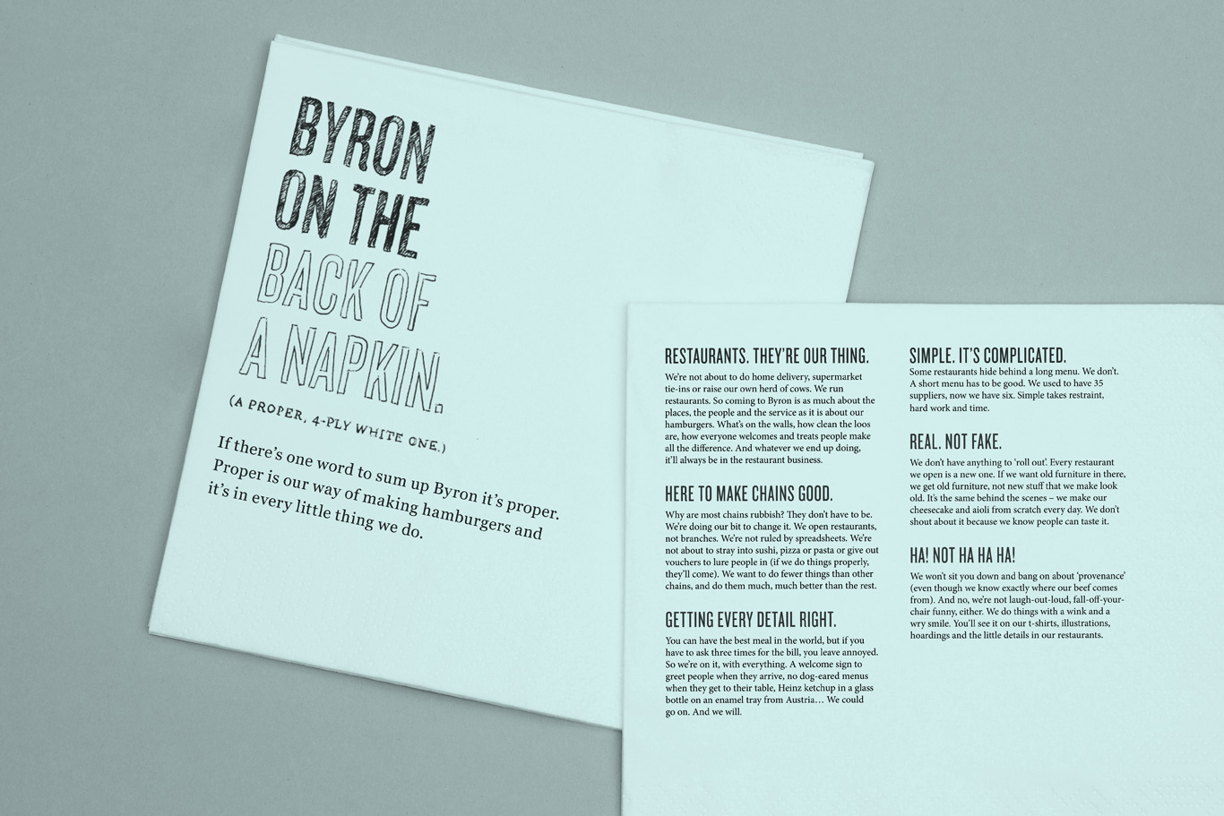
So we wrote about who Byron are. We just didn’t call it a ‘vision’ or write it like one (if that’s what you set out to write, you end up with the same brandified nonsense as everyone else).
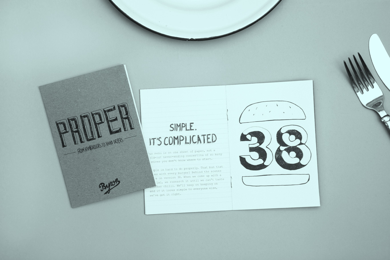
We wrote a book about the brand at the same time. Originally we wrote the book to distract them from obsessing about having a vision (we were upfront about this), but the guide to what ‘proper’ means at Byron became another good introduction to the brand in its own right.

WHAT WE DID.
+ Summed up the brand.
+ Worked on their tone of voice.
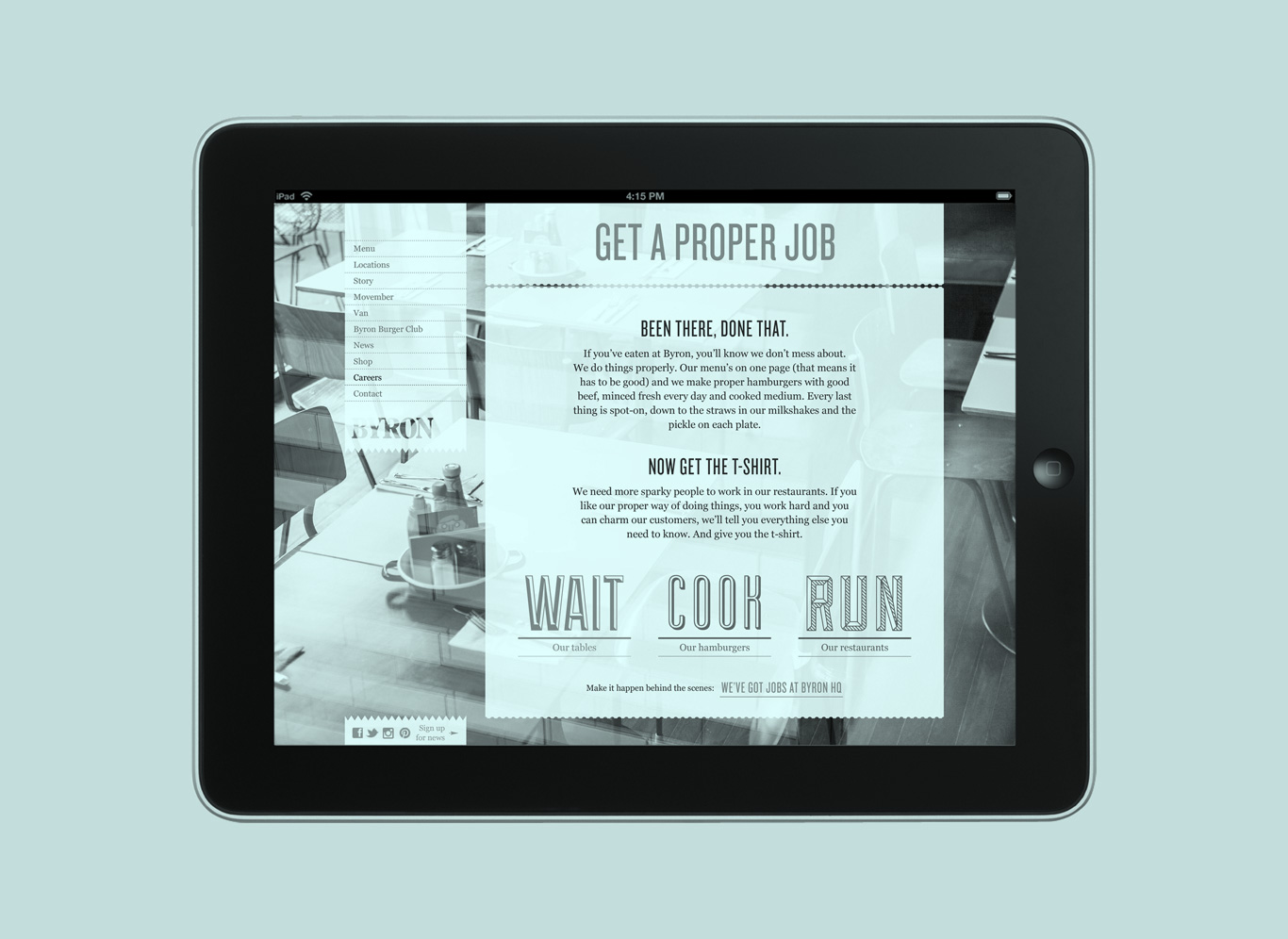
+ Came up with campaigns.
+ Helped them with other wordy jobs.
+ Ate a lot of skin-on chips.
WHAT WE DIDN’T.
+ The design. & SMITH and Charlie Smith Design did that.