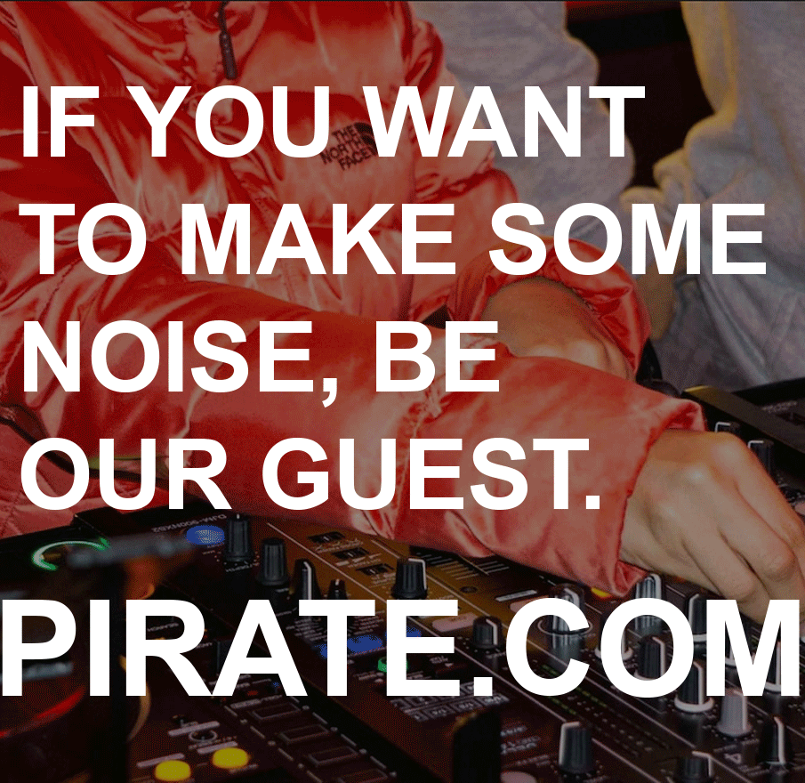
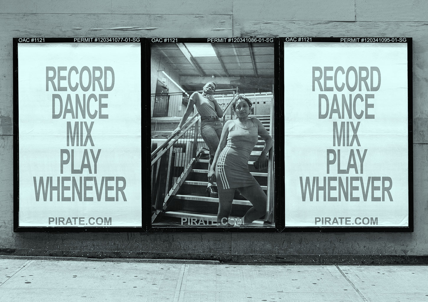
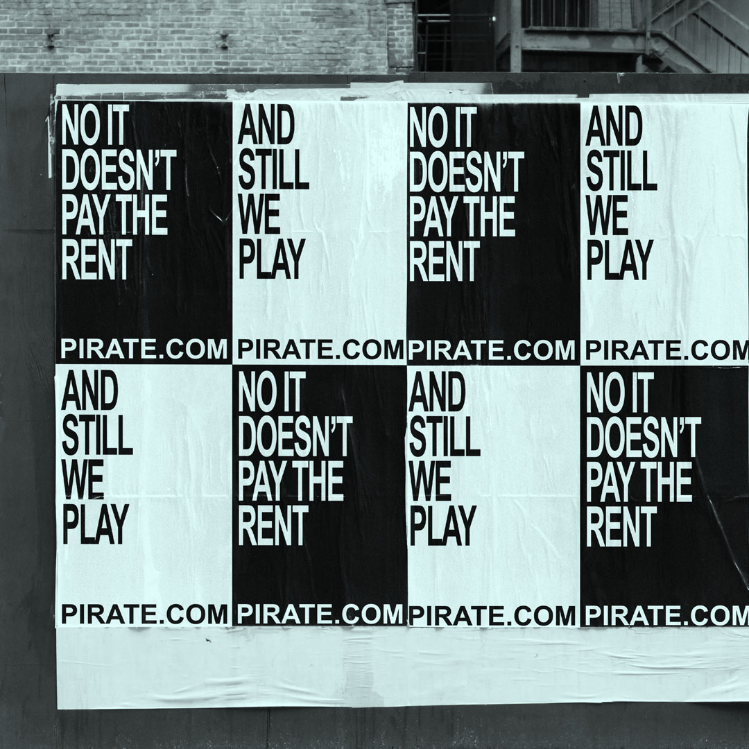
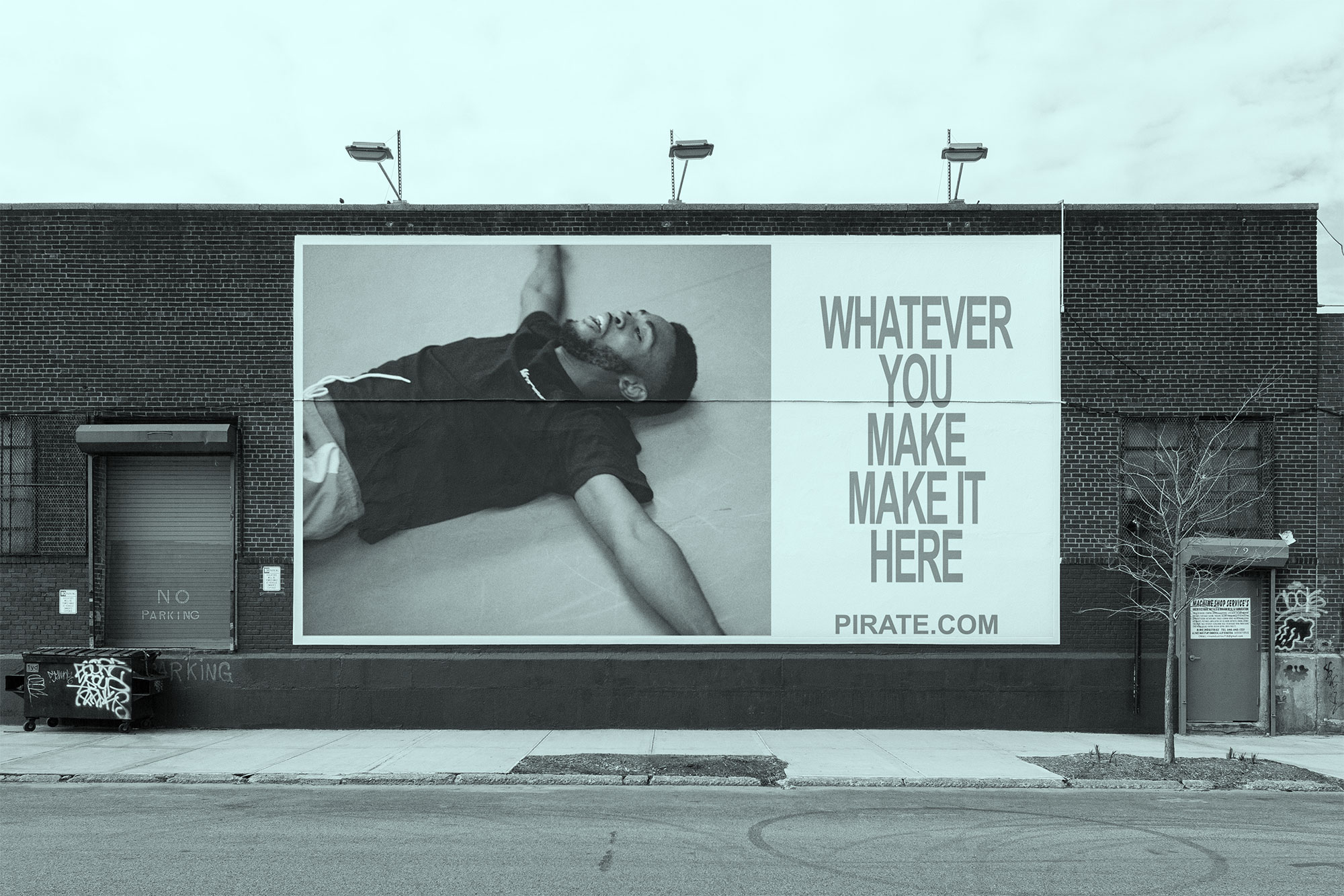
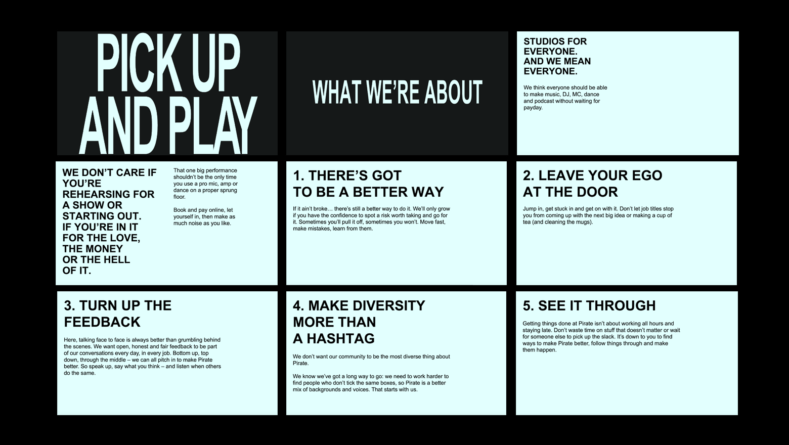
Pirate.com runs over 700 recording studios (and counting) in the UK, US and Europe, which anyone and everyone can hire by the hour – at all hours – to make music, rehearse, DJ, dance and record podcasts. They do the studios and the proper kit, the artists who use them do the rest, so Pirate’s brand identity is deliberately pared-back and D-I-Y. There’s no logo, the colour palette is black and white, and their typeface is Arial. The design agency chose Arial because it’s “one of the most democratic, widely available and freely licensed fonts in the world”.
So how do you make the words interesting when everything around them is bare bones? We came up with a clipped tone that’s so pared back, it’s stylised. No twiddles, no tricks, no showing off. We always edit our words, but this time we edited them again. And again.
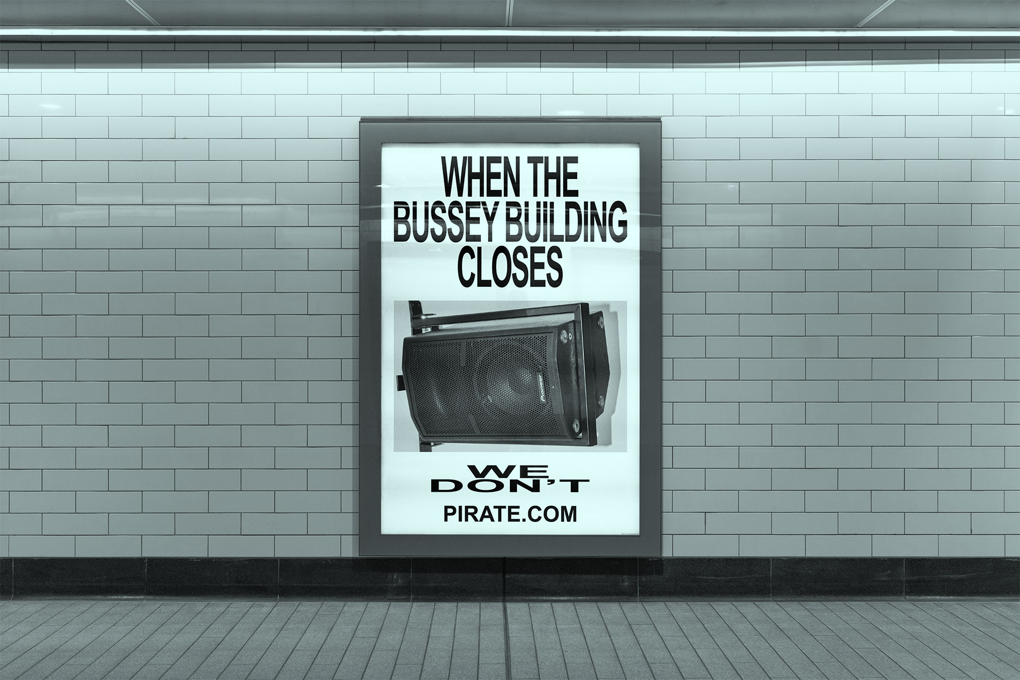
At the same time, we didn’t want the words to be so factual that they were plain or boring. That’s not a tone. We made sure there were ideas behind the words. For example, when we looked at a trio of 140-character headlines for Pirate’s Google ads (an important part of their advertising), we swapped the usual plain, descriptive headlines like “24/7 Studio dance hire” for more punchy statements that sum up why people should hire a studio: “A Bedroom Isn’t A Studio. This is”.
More than that, though, we came up with a bigger brand idea to thread through everything. When we talked to Pirate’s founders about this at first, it made them feel a bit queasy. They were keen for the brand to take a back seat and be so hands-off it’s neutral. They don’t mind what people do in their studios, they said, they just want everyone to have the chance to use them and do their thing. It’s not about us, it’s about them. But that, we said, was their point of view. And we turned the volume up on it. To eleven…
When it came to summing up what Pirate stands for inside the business, we worked on the words in the same way we would for an ad on social or on a billboard. Which means letting go of any pat HR cliches. It helped that the Pirate team knew the broad corporate-statements they’d been debating for months didn’t sound like them. They just couldn’t put a finger on why. Stripping it all back helped, especially when we were summing up ‘How to be Pirate’ because we asked the founders to really think about what they wanted to say with each point first. And then we edited and re-edited the headlines until they packed a punch in the Pirate tone.
WHAT WE DID
+ Worked out Pirate’s tone of voice.
+ Summed it up in snappy guidelines.
+ Trained people in different teams (including social, HR and digital marketing) how to use it.
+ Summed up their brand, making sure it didn’t sound corporate or preachy.
WHAT WE DIDN’T DO
+ Their visual identity. Design studio Only did that.