Here’s what I want from Airbnb. I want a website and app that work beautifully. I want to find an apartment so I can pretend I live in Brooklyn (even if it’s just for a week). And I want to make a few quid from my own apartment on the side.
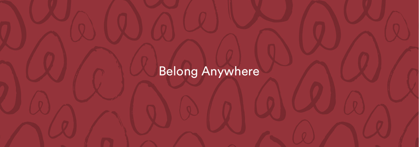
Here’s what I don’t want. A “New Airbnb,” a logo with a cutesy name and a “belong anywhere” brand story. A week on from all the hoo-ha, I don’t mind whether you love Airbnb’s logo or whether you think it looks like a vagina. It’s the stuff around the rebrand that bothers me.
A grandiose launch seems enough to make most people believe the hype and convince themselves that Airbnb’s brand is now “more than a logo.” I’m not so sure. Because beyond the logo there isn’t much there.
They’ve made a film about it, “the story of a symbol of belonging”:
I don’t know what’s more depressing, that as brands get bigger, they all feel the need to dress up what they do with quasi-philosophy, or that no-one seems to have noticed what a load of cobblers it is. I think otherwise sane people in branding have become so desensitised to watching cartoons with a strumming acoustic guitar soundtrack, that they don’t actually read the “We are all yearning for a sense of place” words anymore.
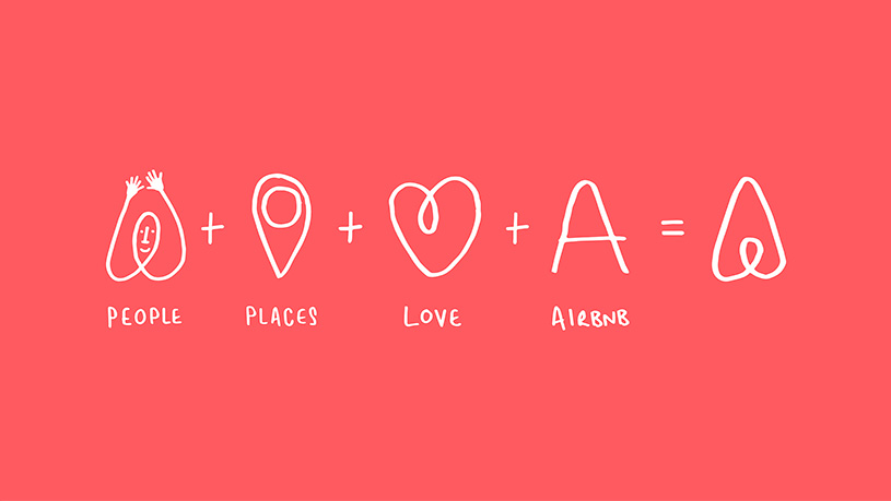
In case you don’t have time to watch Airbnb’s little film, I’ll bring you up to speed. It tells the story of their new symbol, which has been given (and I’m not making this up) a name. It’s called the Bélo (with an accent on the e because that sounds foreign if you’re not French), and apparently it stands for four things: people, places, love (three random, over-used words) and Airbnb itself. Their website tells us:
“belonging has always been a fundamental driver of humankind.”
Meanwhile, Airbnb’s CEO, Brian Chesky, says their logo is
“an iconic marque for our windows, our doors and our shared values.”
Ay?
Brands and agencies seem to be part of a merry dance to churn out more and more of this stuff, as if the bigger and broader the statements, the more profound (and important) brands automatically become. What actually happens is that everyone starts gravitating to the same boring branding words. Every brand is “sharing” x, y and z, and we’re all “connected” to something. The Stereo MCs were way ahead of their time.
I put a lot of the blame for this stuff at the door of strategists, planners and brand executives who seem to think that branding is “more than a logo” which means creating a logo and coming up with a lot of puffed-up nonsense to justify it. It’s hot air.
Of course, it could be that the Bélo back story is just PR spin, which got the internet’s attention, for sure, but then there’s nothing the internet likes more than a rebrand of one of its own. If that’s the case, the new logo’s just a simple mark (albeit one with a token “you can design your own logo” bit tacked on). If that smartens up Airbnb and makes it look less like a start-up, fine. Just don’t believe the hype.
I like Airbnb, I really do. I like how simple it is. You can explain it to someone in ten seconds. The problem is that all the people, places, love bleurgh is over-thought and complicates it. Somehow “belong anywhere” doesn’t feel like it belongs to Airbnb at all.
A version of this blog post was also published by It’s Nice That.