Museums and galleries have a tried-and-rarely-strayed-from formula for campaigns. There’s nearly always a lead picture (that has tested well with focus groups), alongside the exhibition’s title. Any five-star reviews get added on later and there’s a last “final weeks” push before the exhibition closes. Often, though, that way of doing things preaches to the converted and we’ve always been keen to see if we could help a museum stand out from the crowd.
When the Natural History Museum asked us to pitch for their campaign last year, they wanted to try something a little different and promote the museum itself, not just the exhibitions that come and go. So, we said, it’d be good to go back a step and explain why people should go there vs other places.
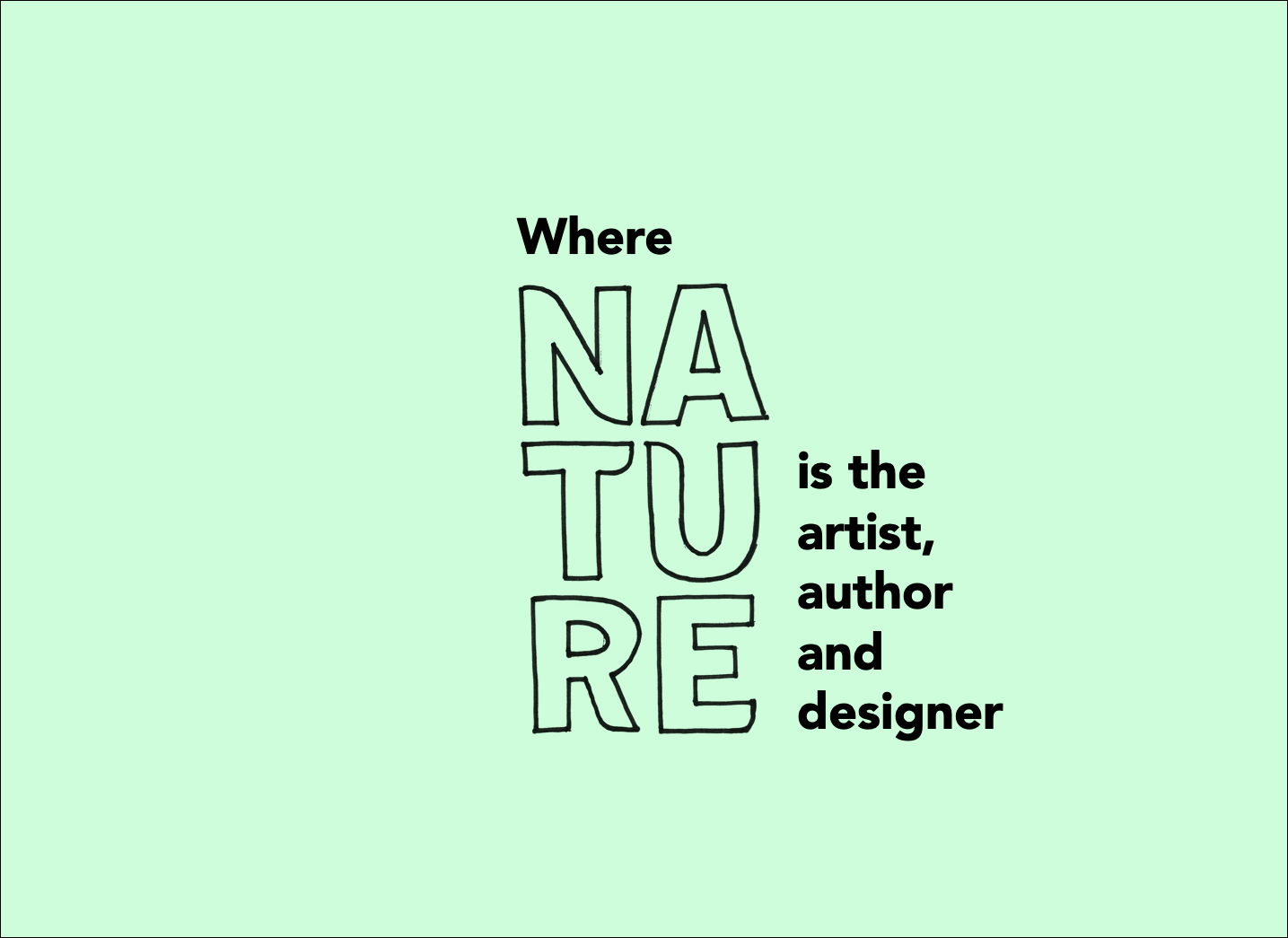
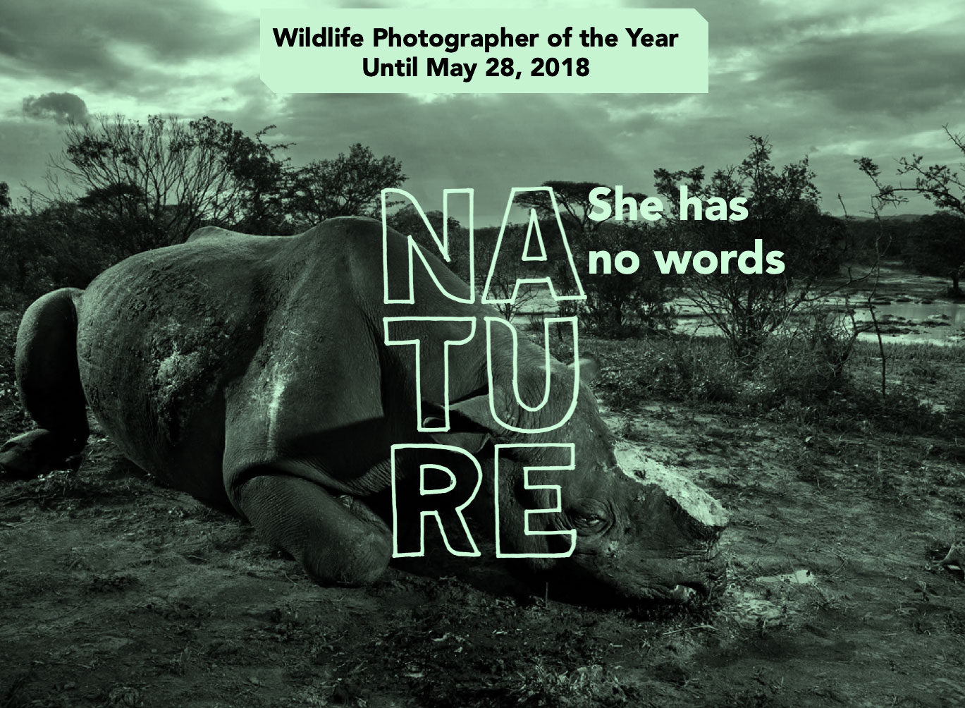
Our working hunch – borne out of some of their research – was that some people knew the Natural History Museum as the place with dinosaur bones. But it all got a bit fuzzy after that. When people power-walk past ads on the tube, they don’t really, properly take in what “natural history” means. It’s “nature.” That’s their thing. They’re the only museum about nature – not old artefacts or art created by people.
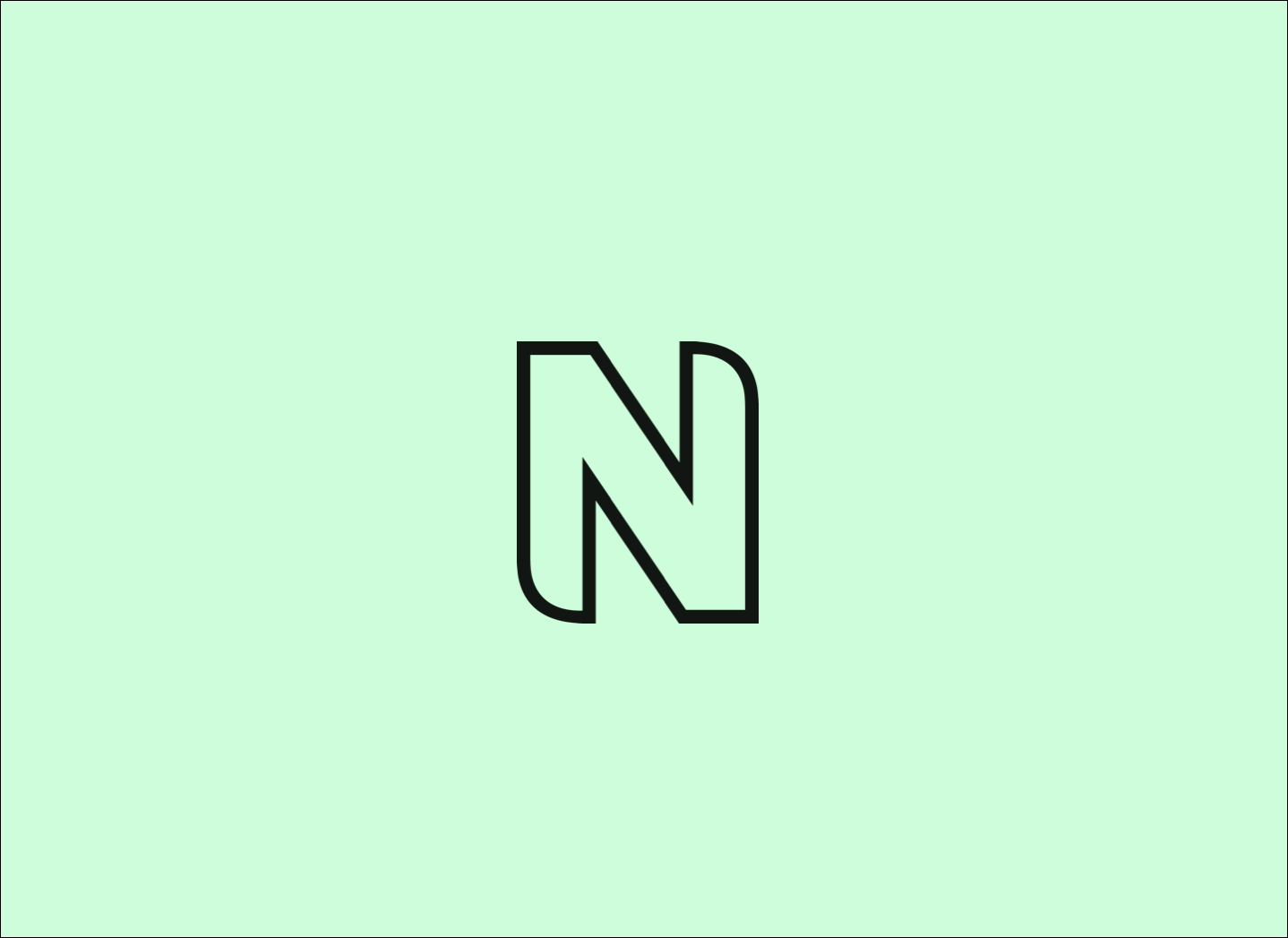
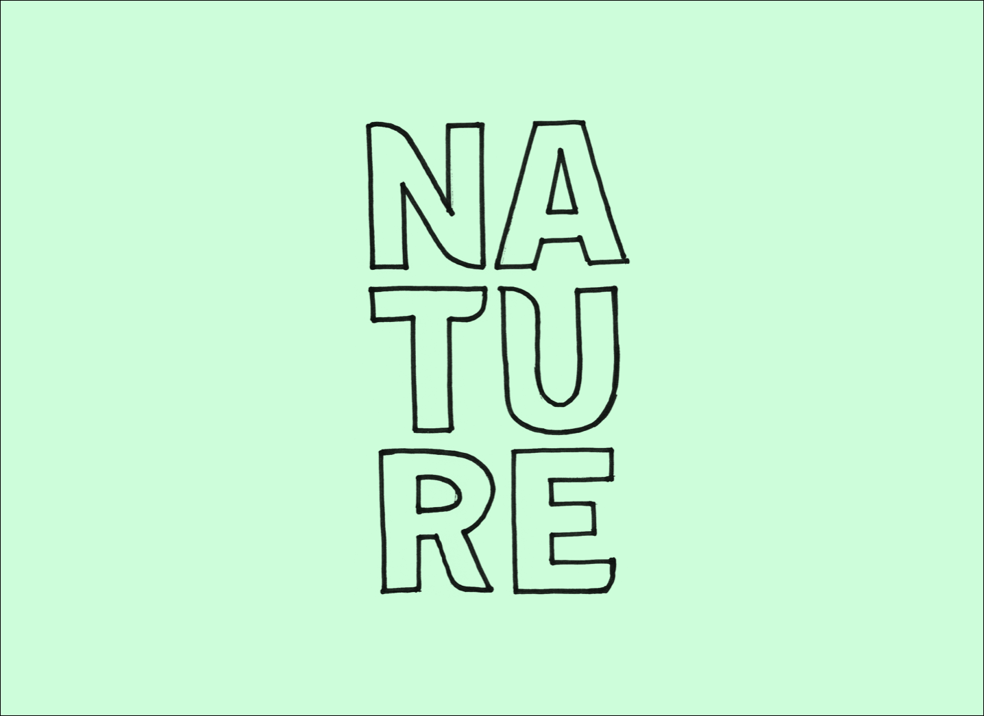
Our pitch (mock-ups coming up) honed in on the “N” in their logo and getting it to stand for “Nature”:
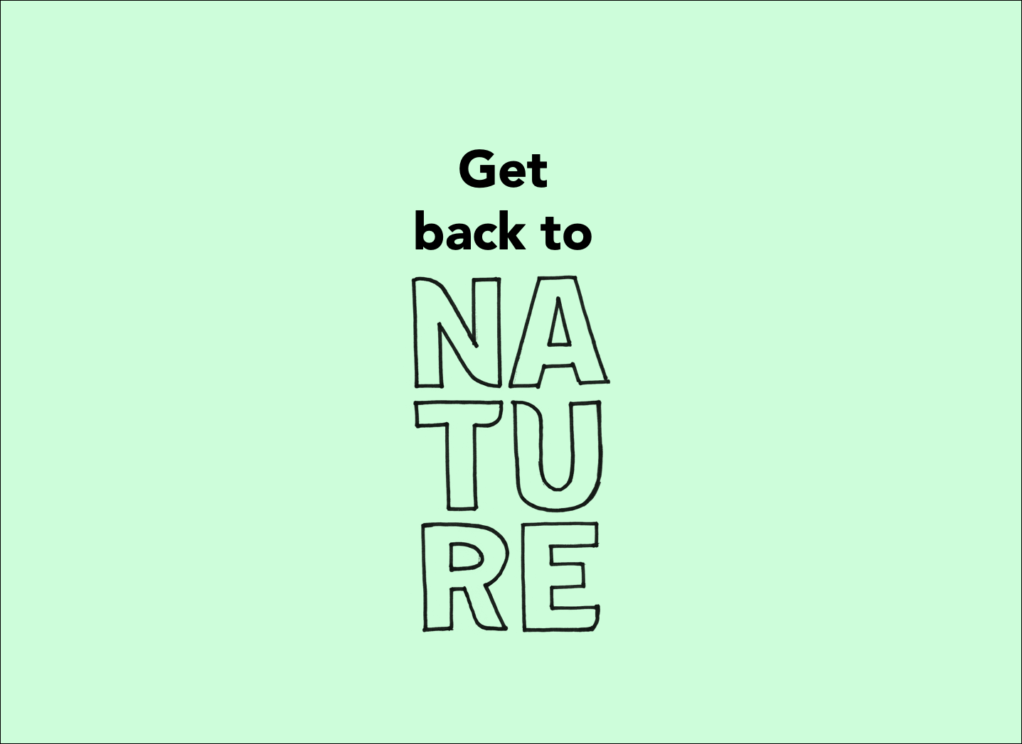
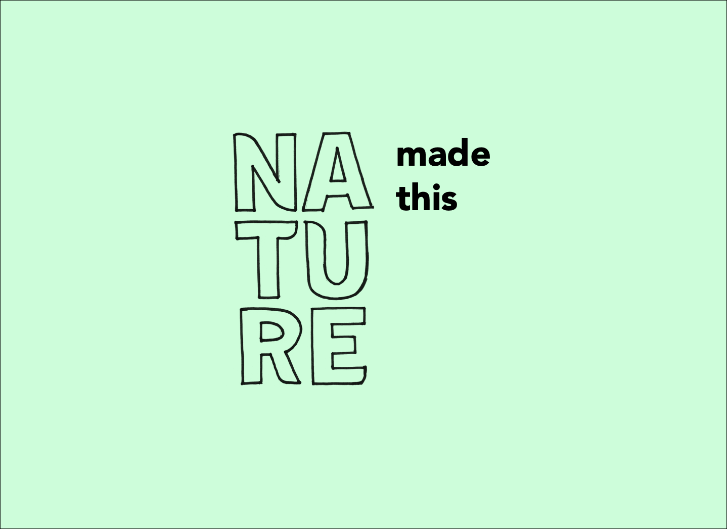
Which they could play with in lots of ways, like this:
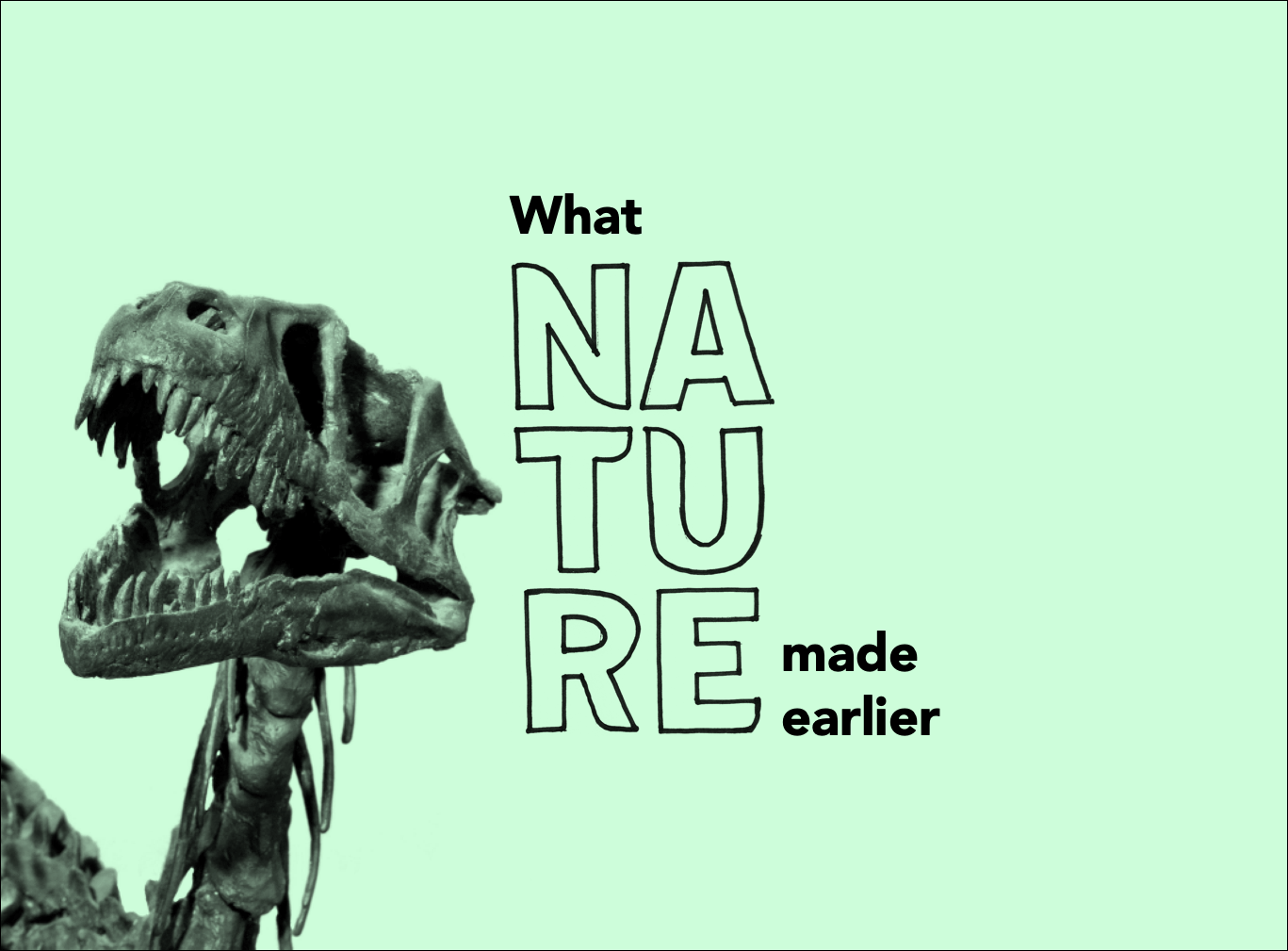
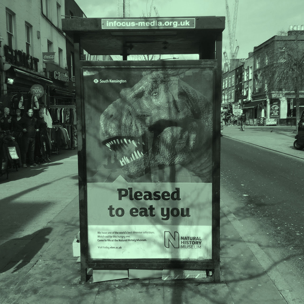
They could talk about dinosaurs – still the reason most people visit:
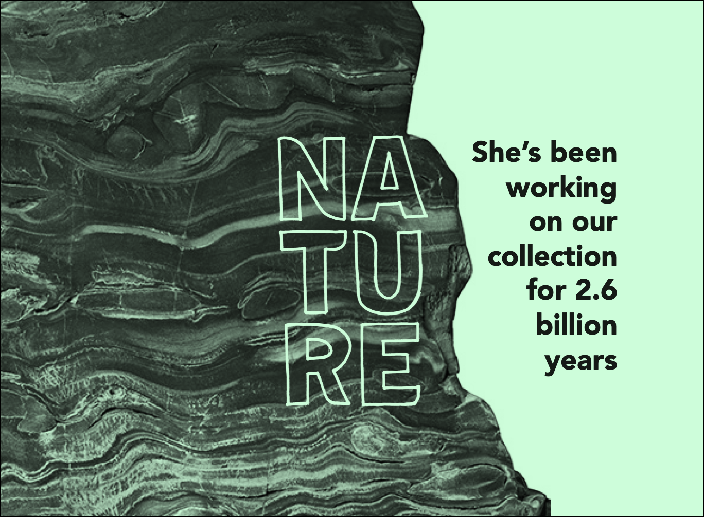
Along with the rest of the collection and everything else they do:
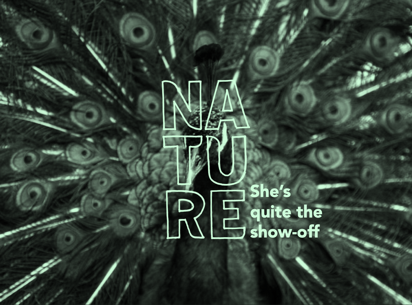
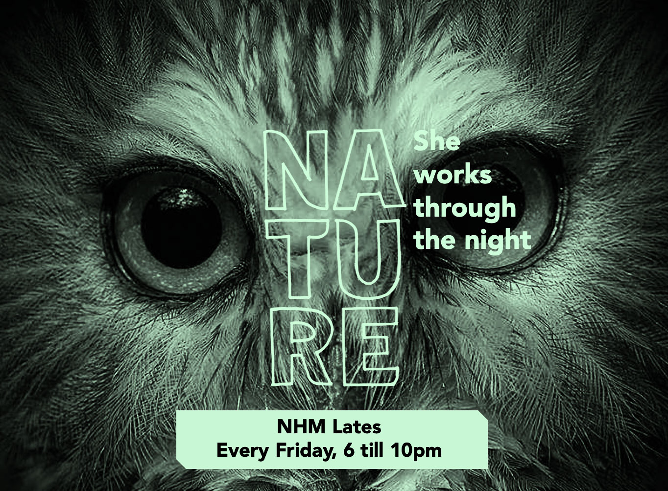
Make serious points:
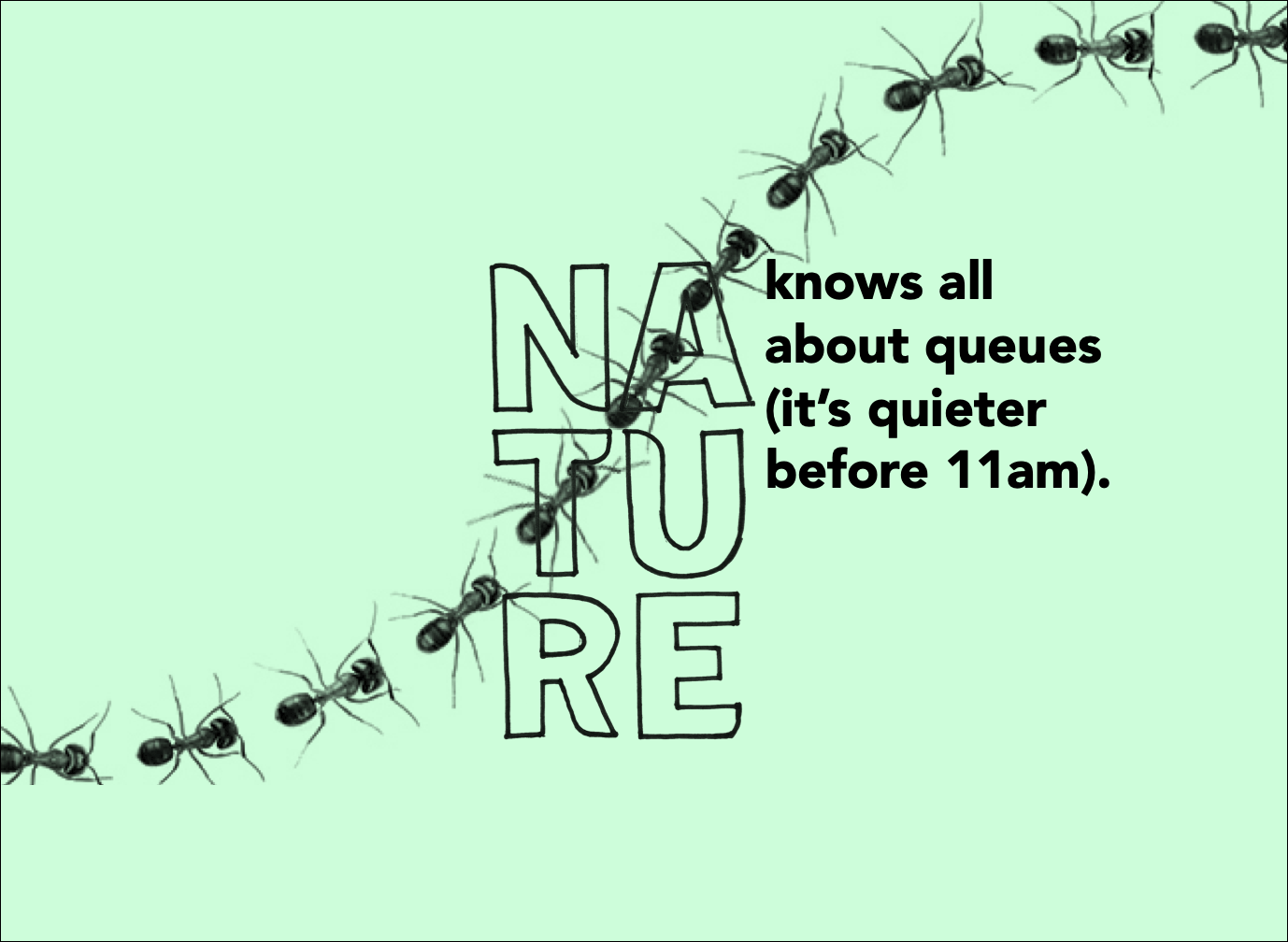
Or write about things with a lighter touch (the dread of queues is something that puts people off going to the Natural History Museum in the first place):
You win some, you lose some. In this case, to Someone – a branding agency who won the work. We were the two frontrunners, but the Natural History Museum went for their lighthearted approach:
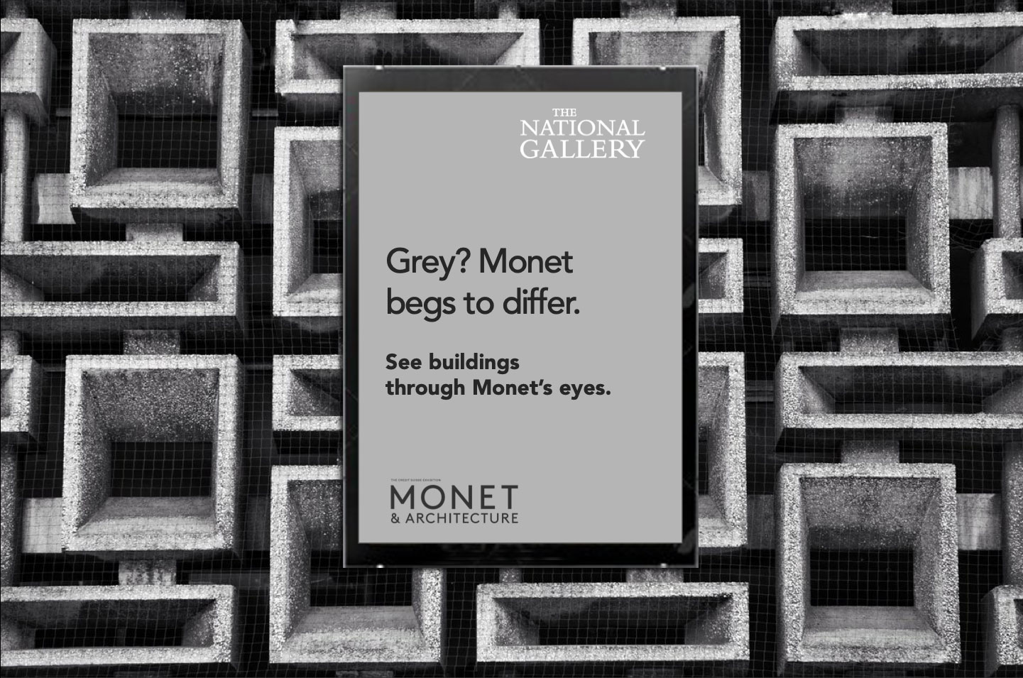
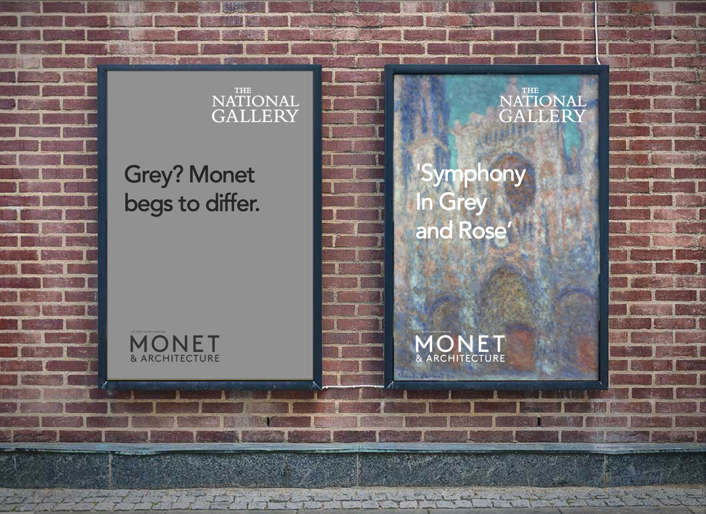
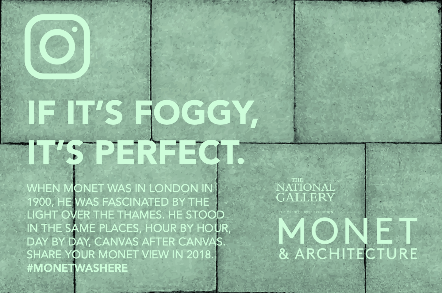
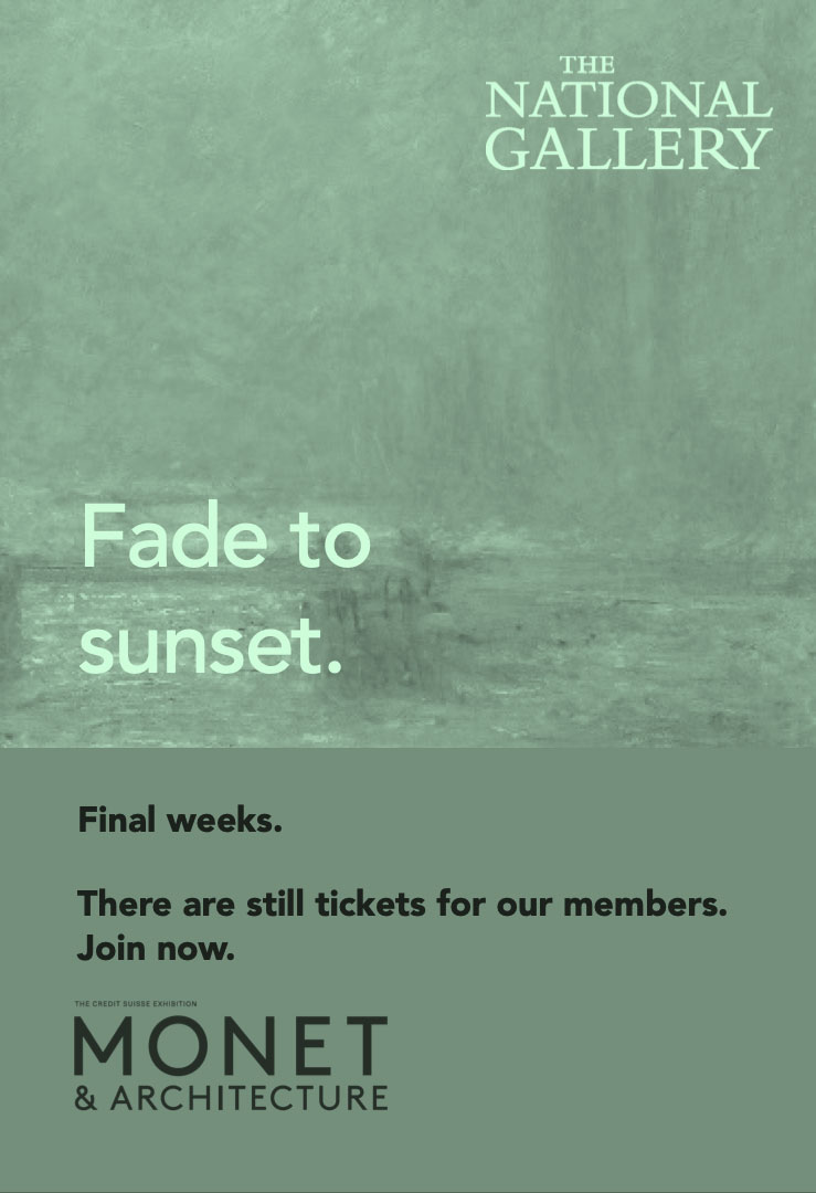
Next up, some work we did for the National Gallery’s exhibition, “Monet and Architecture”. A lot of our words did get out into the world – we’ve been working with the National Gallery for the last couple of years. But here are a few extras that pushed the edges of how to do campaigns for museums and galleries:
We’ll show more of our work for the National Gallery later this year. And here’s another post in our occasional series of work that got away, this time for drinks and spirits.